
Hello! I'm Tiffany
A product designer based in NYC, and an illustrator/writer in my free time.
Previously at Square.
TWITTER FOR ART
A personal project I've been working on that involves social media and its relation to the art community

Redesigning Twitter for Artists
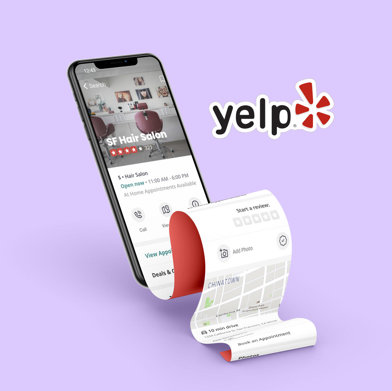
yelp for small business recovery post-covid
YELP APPOINTMENTS
An improved Yelp booking experience to better accommodate small businesses affected by the pandemic
OTHER PROJECTS
Some projects I've worked on for classes in the past!

Finding the perfect stay made easy
revamping -- check back soon!
Overview
Helping businesses stay verified as they evolve
Designing Square’s US business verification refresh experience so sellers can confirm what’s current, update what’s changed, and understand what comes next.
Timeline: Q1 2026
Role: Product Design Lead (Identities)
Collaborators: Product · ENG · Compliance · Legal · Risk
My role
I inherited the project after some initial core concepts and high-level flows had been established. I developed the detailed experience across business types and error states, working with Product, ENG, and Compliance to clarify unresolved requirements and keep the project moving, as well as partnering with other design leads to align the experience with Square’s broader vision for identity management.
Expected impact
Designed for a planned population of 400k+ eligible US sellers, KYB Refresh aimed to:
Keep businesses compliant. Establish a repeatable process for maintaining accurate business and ownership information.
Protect sellers' ability to take payments. Help sellers complete required updates before account restrictions become necessary.
Limit verification costs and effort. Let sellers confirm unchanged information, reserving reverification for updates that require it.
Support ongoing identity management. Establish patterns that future self-service and multi-entity experiences could build on.
PROBLEM
Square collected business identity information at onboarding but lacked a systematic US refresh process, resulting in outdated records as businesses continued to change.
| For sellers | For Square |
|---|---|
| Required verification could put their ability to accept payments at risk | Keeping records current meant balancing compliance requirements, verification costs, and business disruption |
SOLUTION
Design an experience that enables sellers to confidently review and update required business and ownership information with clarity, minimal friction, and clear understanding of consequences.
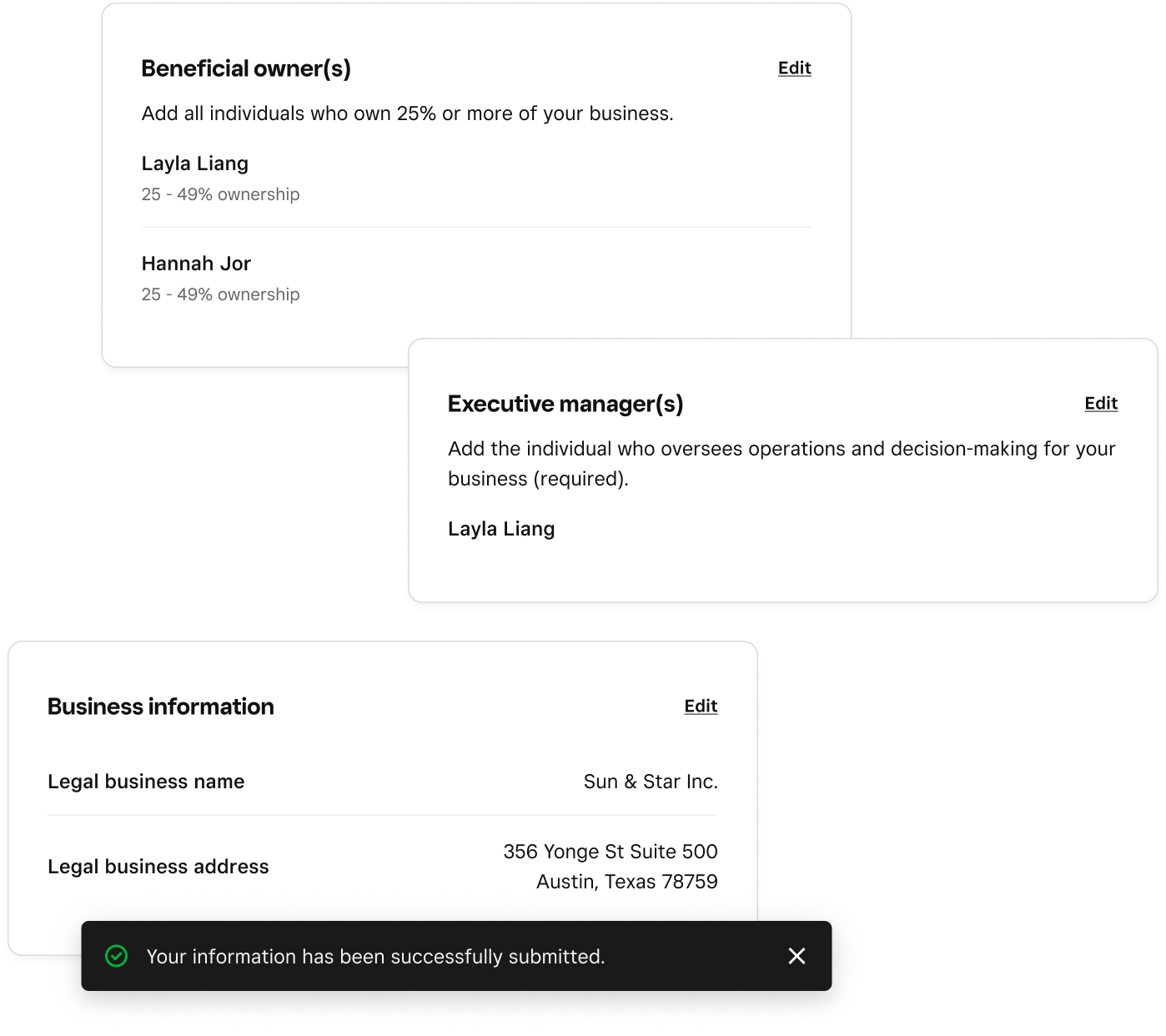
Review existing info
Prefilled information lets sellers review and submit when nothing has changed.
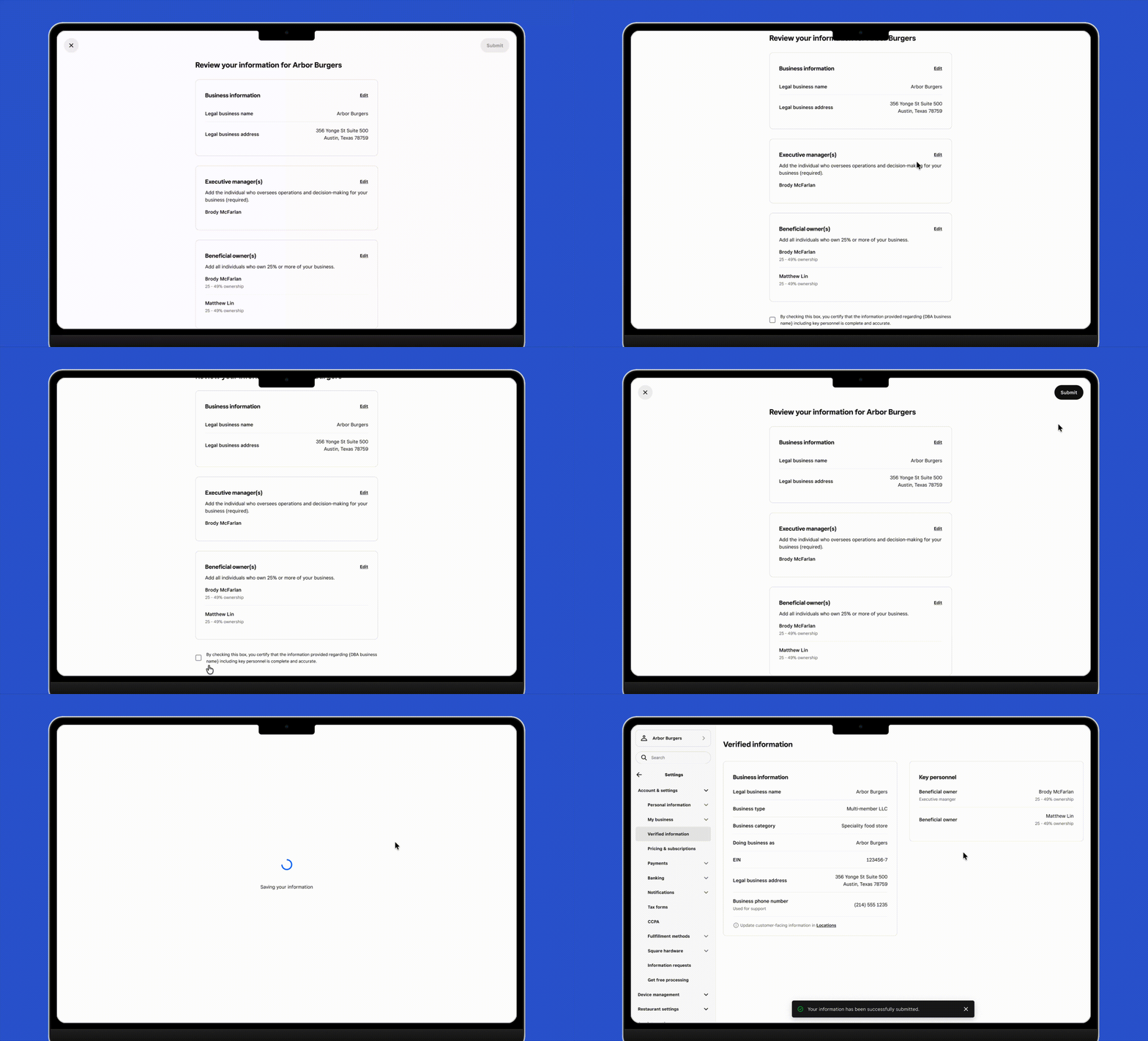
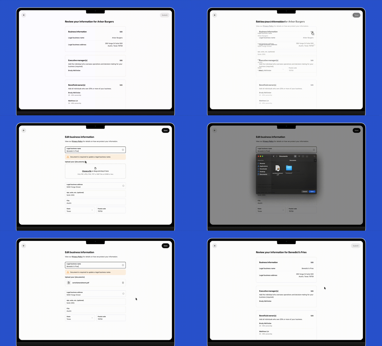
Update what matters
Focused editing flows let sellers update their details, with reverification where required.
Know what's next
Clear status and guidance help sellers know when verification is pending or further action is needed.
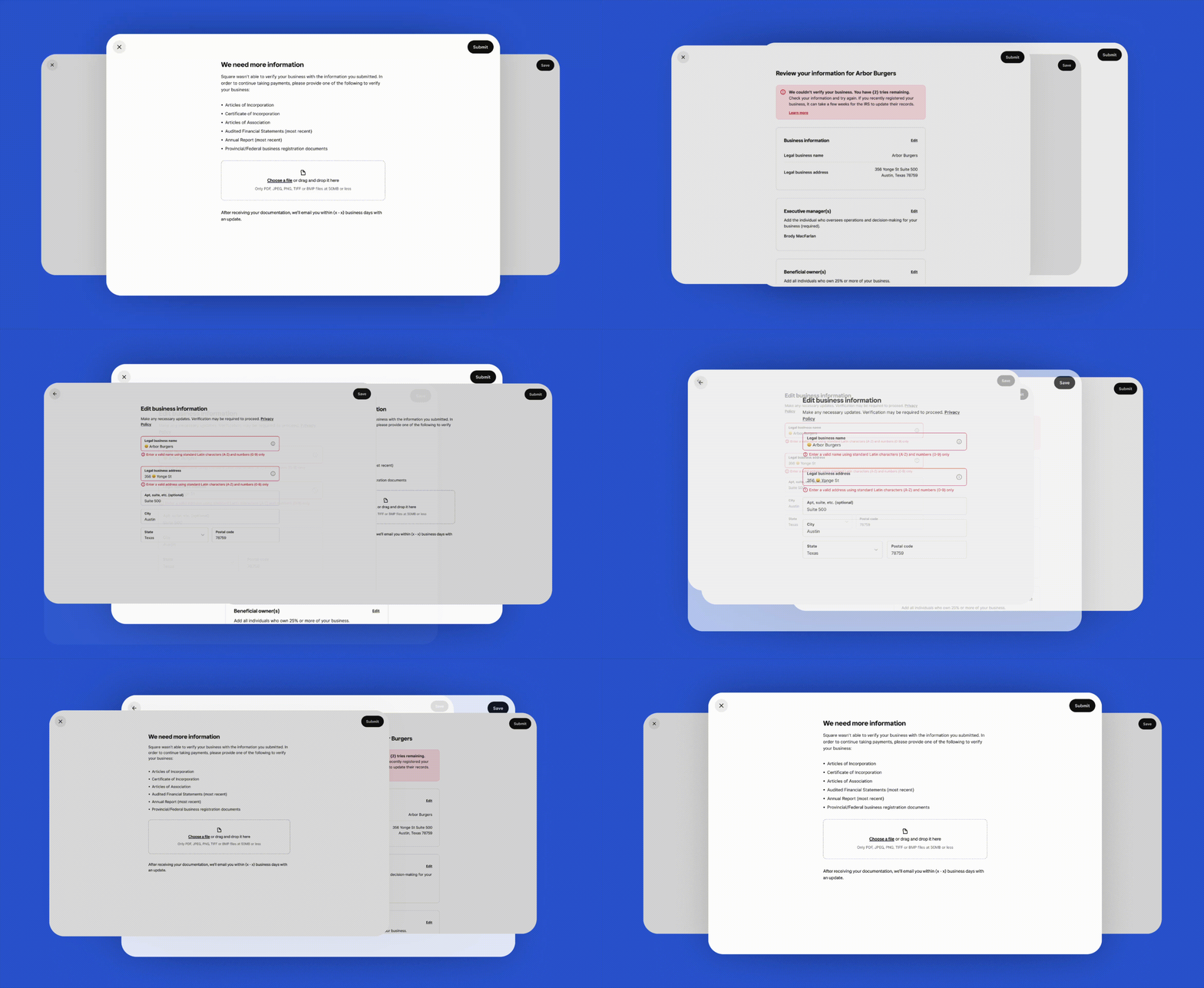
01
Navigating complexity
Reconciling roles with people
One of the biggest questions was how sellers should understand the people connected to their business.A single person can simultaneously be an Executive Manager and a Beneficial Owner. The emerging product direction organized the experience around these roles, aligning with a longer-term vision for modeling businesses around entities and responsibilities.But Square's underlying data remained person-based.That introduced complexity around certain interactions, and new questions emerged. For example:
If a seller edits someone's information under one role, should the change appear everywhere?
Does removing a role remove the person, or only that responsibility?
Does the interface make it clear whether the seller is editing a person or editing a role?
I worked through those states with the design team, cross functional partners and stakeholders so the interaction rules stayed consistent across the refresh experience.

Edit flow when a person is both an Executive Manager AND a Beneficial Owner

Simplifying the experience
As I worked through the interactions, I questioned whether certain controls added enough value to justify their complexity. One example was the reset functionality.For someone listed as both a Beneficial Owner and an Executive Manager, resetting their information in one section would also undo changes in the other—outside the seller’s current view. It also couldn’t reliably prevent the duplicate-record issues it was intended to help address.I recommended removing reset, with agreement from Product and ENG, to keep editing behavior more predictable.

Earlier designs in edit flow with reset functionality

Keeping delivery moving as requirements changed
Detailed design surfaced issues that required additional compliance and product decisions, including questions like:
What happens when an account holder says they are no longer responsible for the business?
How does failed reverification affect sellers who voluntarily update their information?
How should certain identity changes be represented without creating duplicate records?
Rather than waiting for every question to resolve, I worked with Product and ENG to separate flows we had confidence in from those that remained dependent on policy decisions.
| Ready to build | Still evolving |
|---|---|
| Primary review experience | Transfer of Account behavior |
| Core business-information flows | Certain legal-name change scenarios |
| Known personnel and verification paths | Consequences following failed reverification |
| Major error states |
02
Outcome
Before leaving Square, I completed the core design flows and expanded the experience to account for error states, validation, and edge cases.Seller communications and some account-transfer policy decisions remained open. The project had not launched during my involvement, so completion rates and business impact were not yet available.
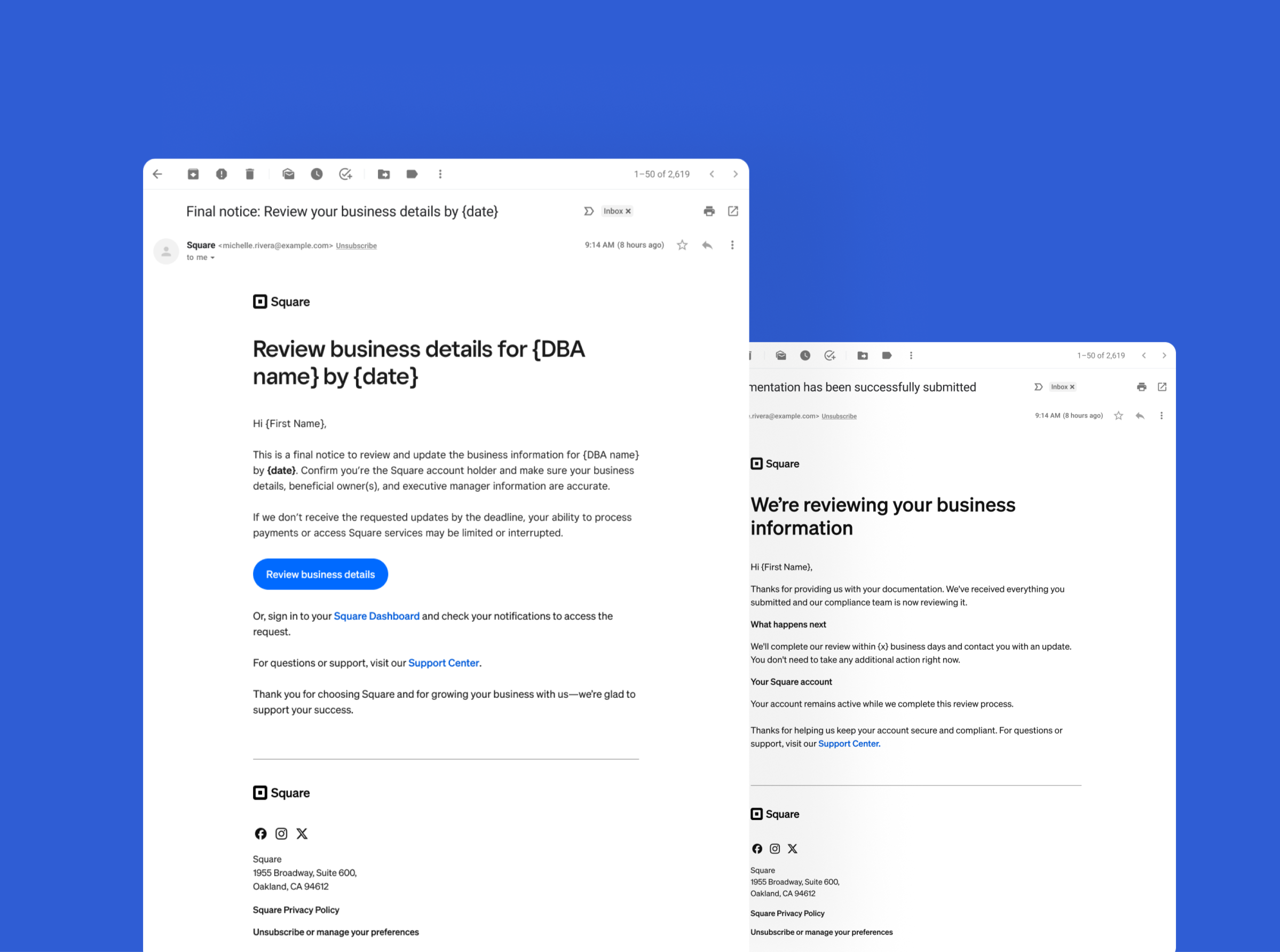
Next steps at handoff
Finalize seller communications. Define when and how to reach sellers, and design notifications and reminders to guide them through the refresh process.
Validate with sellers. Test whether people understand the role-based structure, particularly when one person holds multiple roles.
03
Retrospective
Challenges
A handoff with unresolved complexity. Extending the core designs exposed gaps in interaction behavior and compliance requirements, expanding the work beyond the initial scope.
Revisiting an inherited direction. I had to challenge assumptions as interaction problems emerged, while accounting for how the same design decisions would carry into related business-management experiences.
Future direction vs immediate clarity. Organizing people by business role supported the broader identity strategy, but introduced confusing interactions when one person held multiple roles. We lacked research to validate that mental model.
Learnings
Map policy gaps early. In compliance-heavy flows, small unanswered questions can reshape the entire experience.
Use documentation as alignment glue. Clear flows and decision records helped keep stakeholders aligned.
Other projects you can check out:
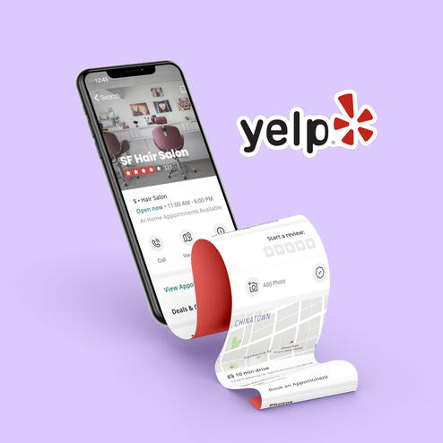
Yelp Appointments

Housing App
Overview
Helping growing businesses organize their locations around how they operate
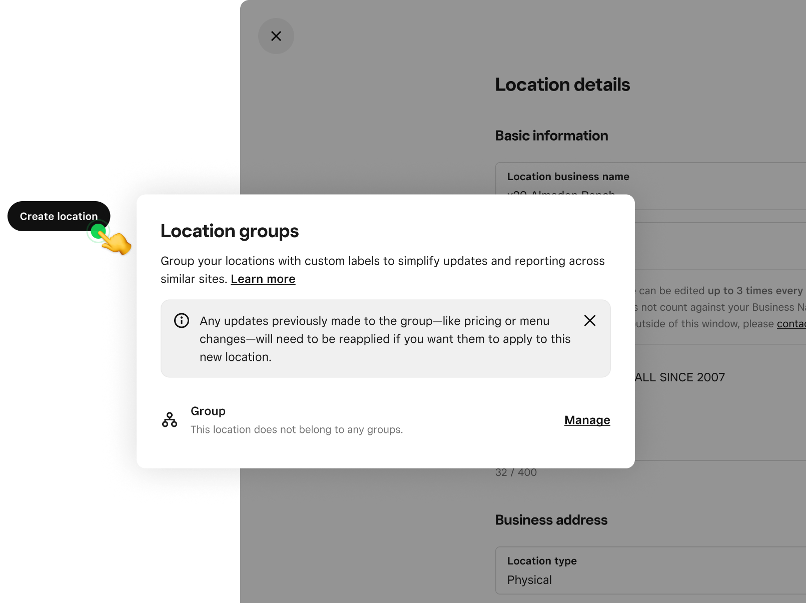
As Square expanded its support for larger businesses, sellers needed a way to organize locations by region, store concept, or operating needs.I designed the experience for creating and managing Location Groups—a shared capability that launched with reporting and established a foundation for future bulk updates across Square.
Timeline: Q2 2025 → GA launch in Oct 2025
Role: Product Design Lead (Identities)
Collaborators: Product · ENG · Food & Beverage · Catalog · Sales
My role
I owned the group creation and management experience from design through seller validation and launch QA.I partnered with Product and Engineering through implementation, aligned with Reporting, Menus, and Catalog teams to defined shared behavior, and advocated for the work’s prioritization across teams.
Impact
Location Groups was strategically important because it supported Square’s move upmarket and its focus on larger, more complex sellers.
For Square, it created a reusable platform primitive that could unlock valuable future workflows across reporting, menus, pricing, and bulk actions.
For sellers, it gave them a way to manage their business using structures that matched their real operations.
PROBLEM
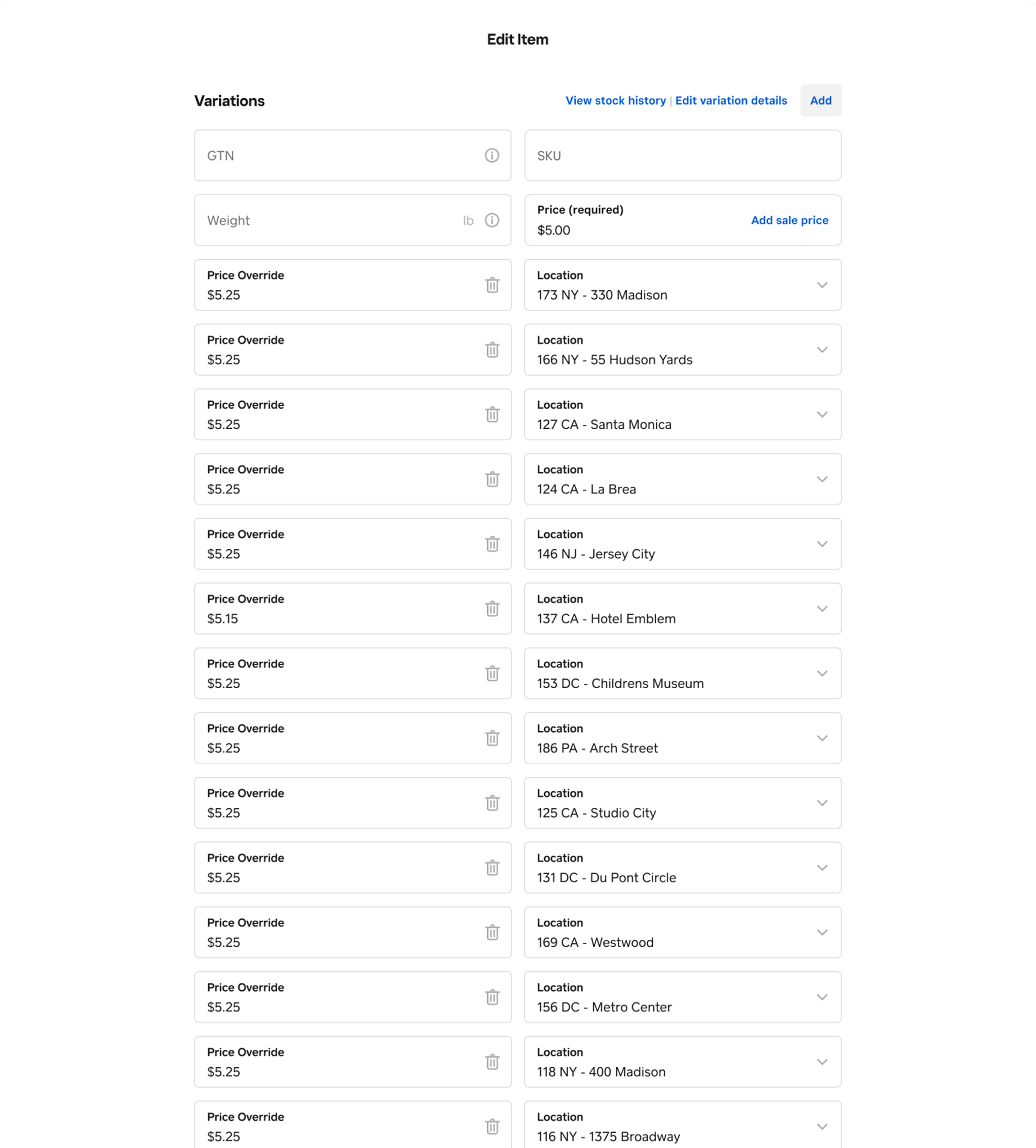
Growing businesses with multiple locations managed stores in sets (e.g. region or concept), but Square’s tools were built around individual locations. Without a way to reflect those structures in Square, sellers had to repeat routine tasks location by location—a time-consuming, error-prone process.
"It took us around seven hours to update prices across all our stores, and we ended up with errors along the way that we had to fix later." — CMO of restaurant chain
SOLUTION
Improve the current experience so that sellers can easily organize and manage multiple locations through intuitive group creation, editing, and filtering interfaces.
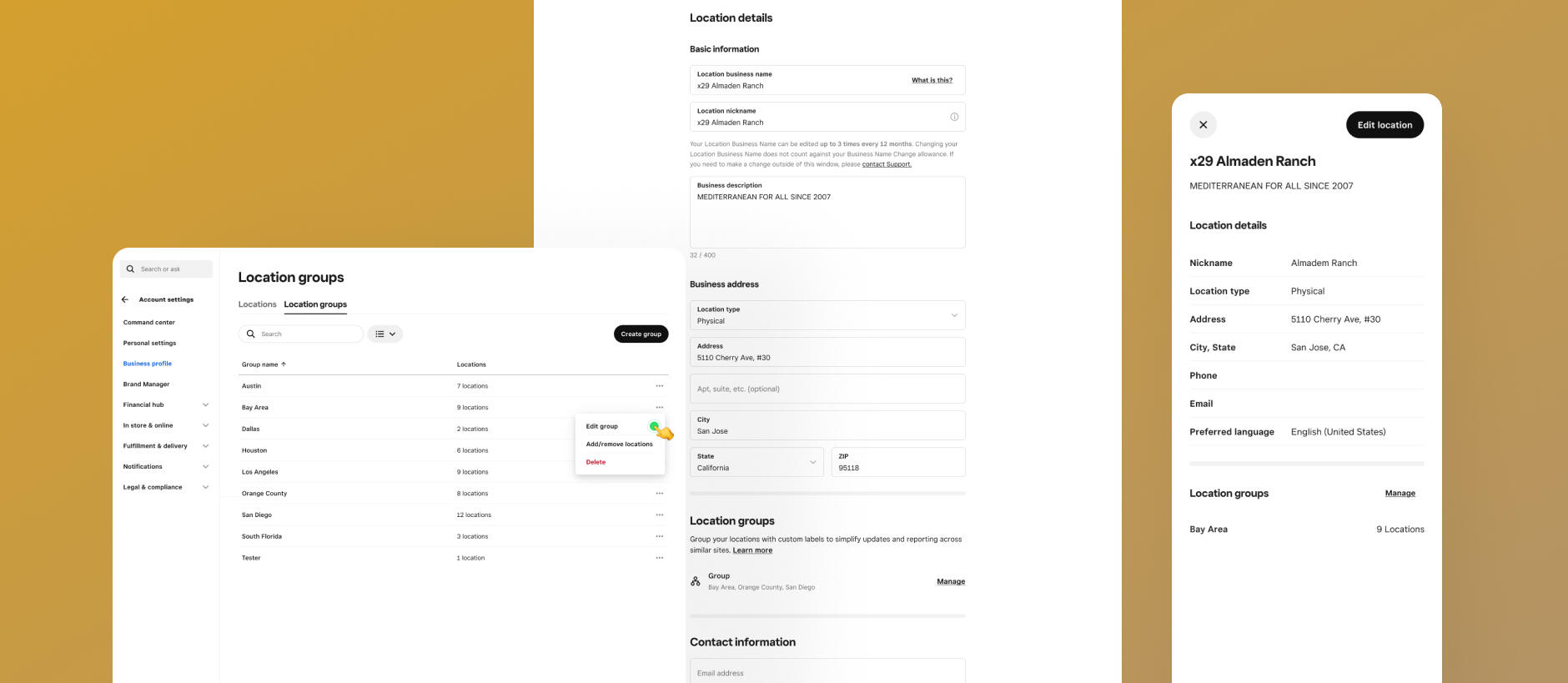
Organize locations around how your business works
View your groups at a glance and create new ones based on region, store concept, or other shared needs.
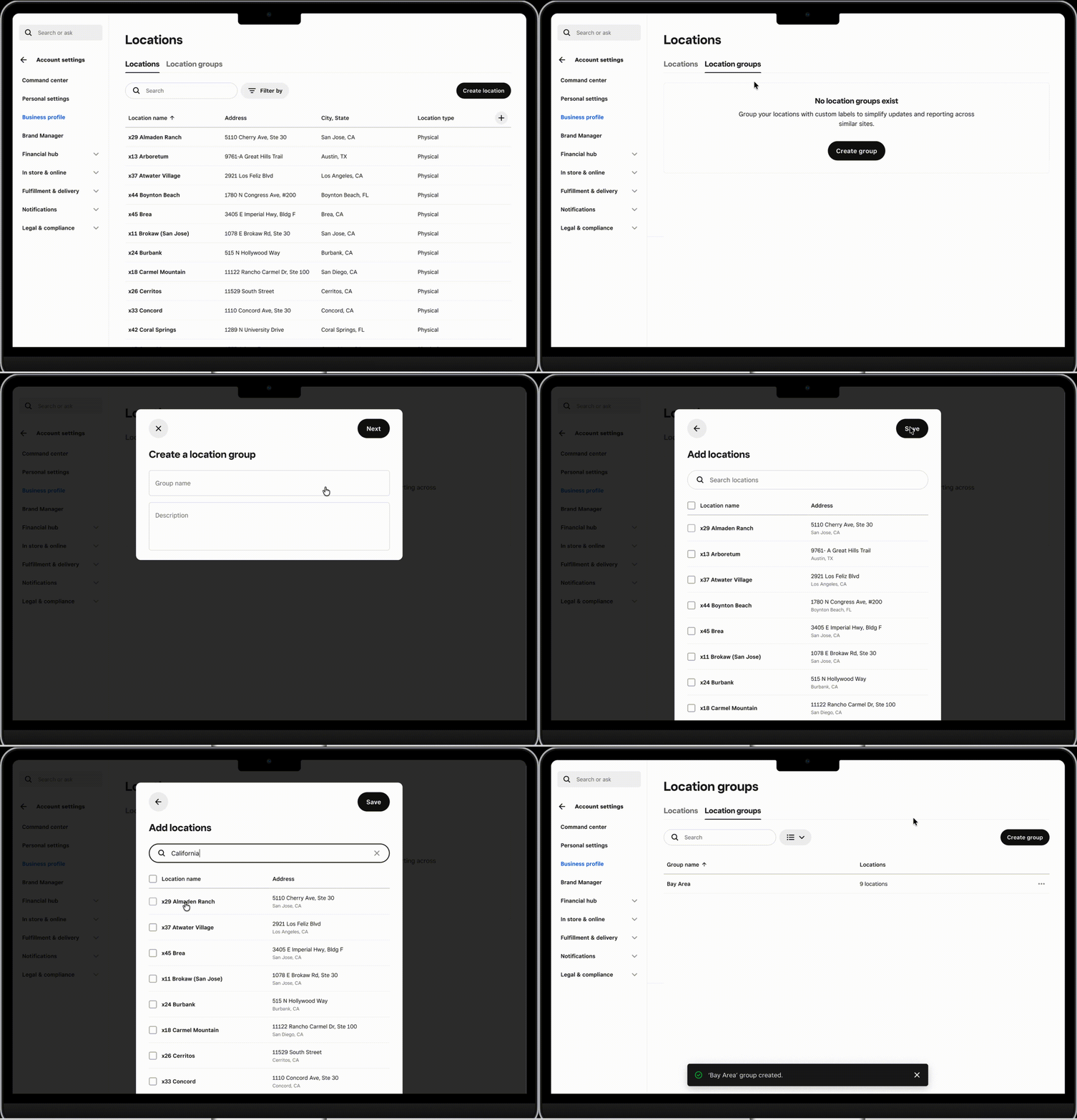
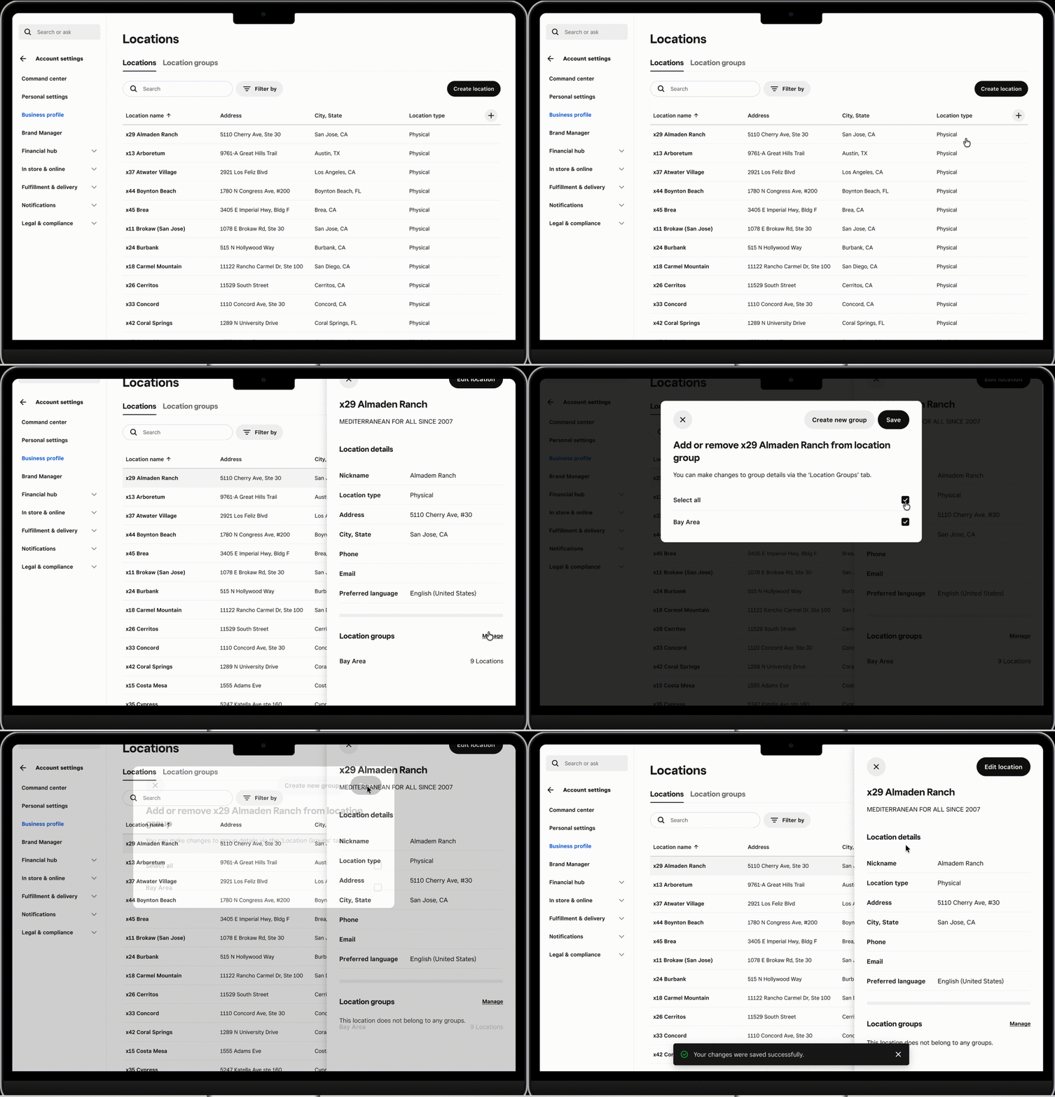
Keep groups in step with your business
Add or remove locations as business needs change, with the flexibility for each location to belong to multiple groups.
01
Key design decisions
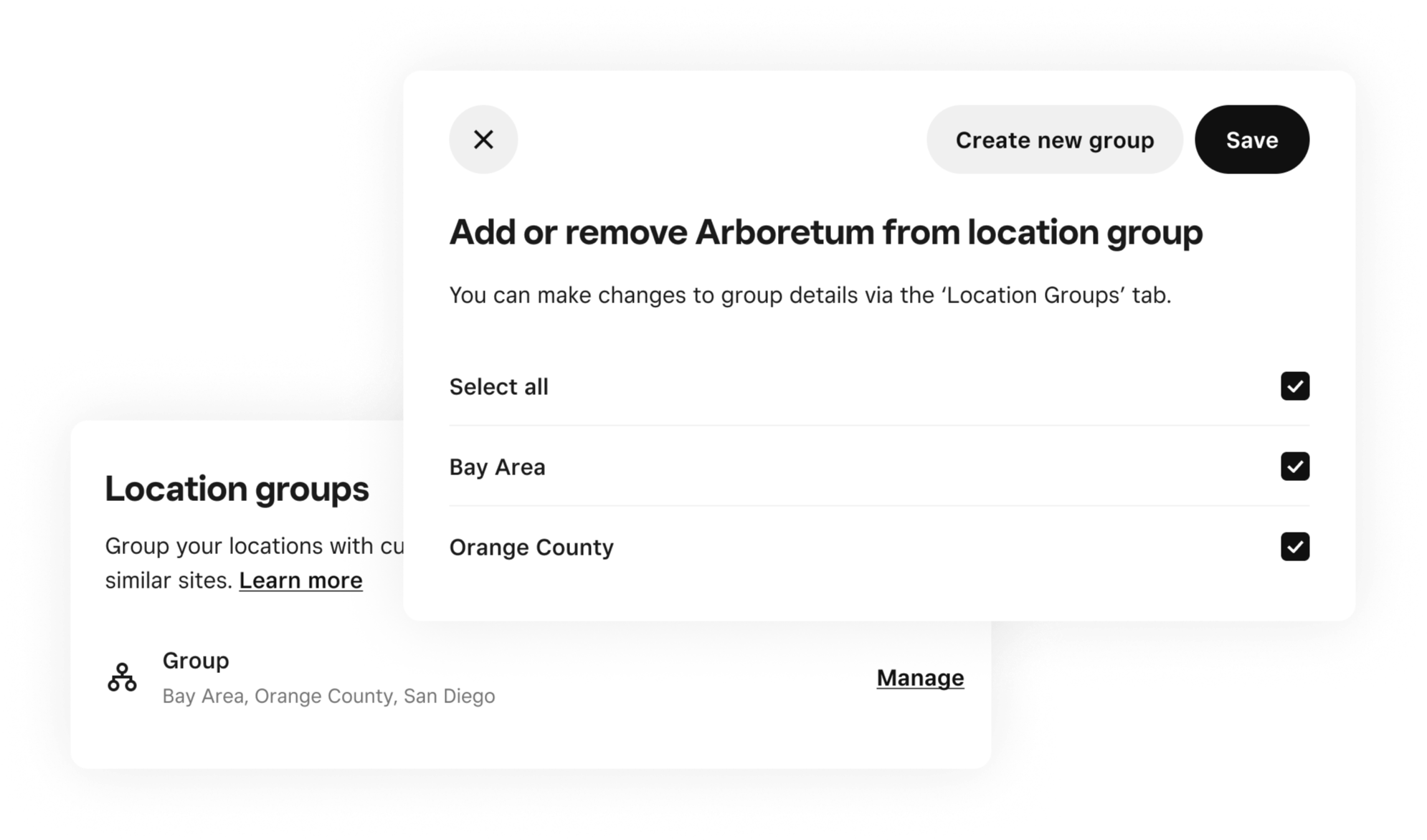
Support overlapping ways of organizing a business
In our interviews, we learned that sellers organize their locations differently depending on the task: a store’s region might determine pricing, while its concept determines its menu. Some groups may be temporary, created for special events or holidays. This means a single location can sometimes belong to more than one meaningful group.Supporting multiple group memberships lets sellers represent these different operating needs without forcing every location into a single hierarchy.
Allow exceptions within a group
A group might contain most—but not all—of the locations needed for a particular update. For future bulk actions, I advocated for selecting individual locations within a group, so sellers could handle exceptions without changing membership or creating a separate group for a one-off task.
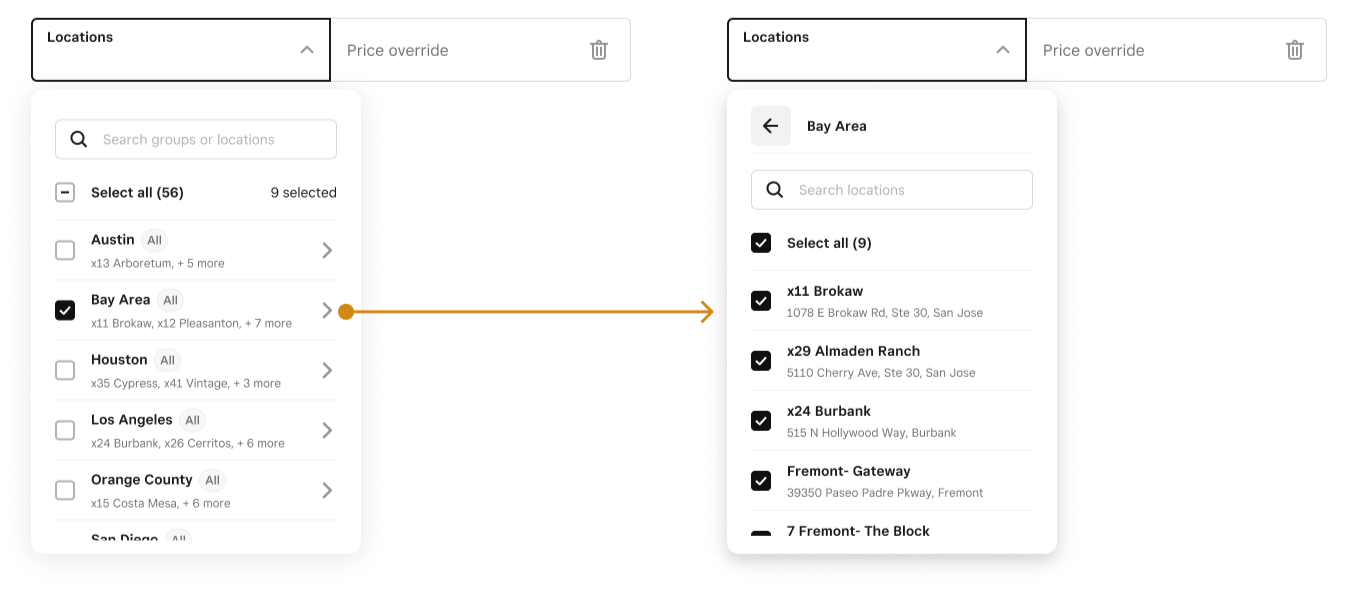
Define shared behavior across products
I co-authored requirements with Product for how groups would behave in future bulk workflows. For example, changing membership would affect subsequent actions while leaving previously applied prices intact. These rules gave Menus and Catalog a common foundation for designing their integrations.
02
Outcome
Within three weeks of the October 2025 launch:
900+ merchants had created groups
1k+ groups had been created
3k+ unique locations had been added
During prototype testing, sellers reported that group configuration matched what they expected to do and where they expected to find it.The launch demonstrated early adoption across markets. Time savings from bulk pricing and menu updates remained a future outcome to measure.
What comes next
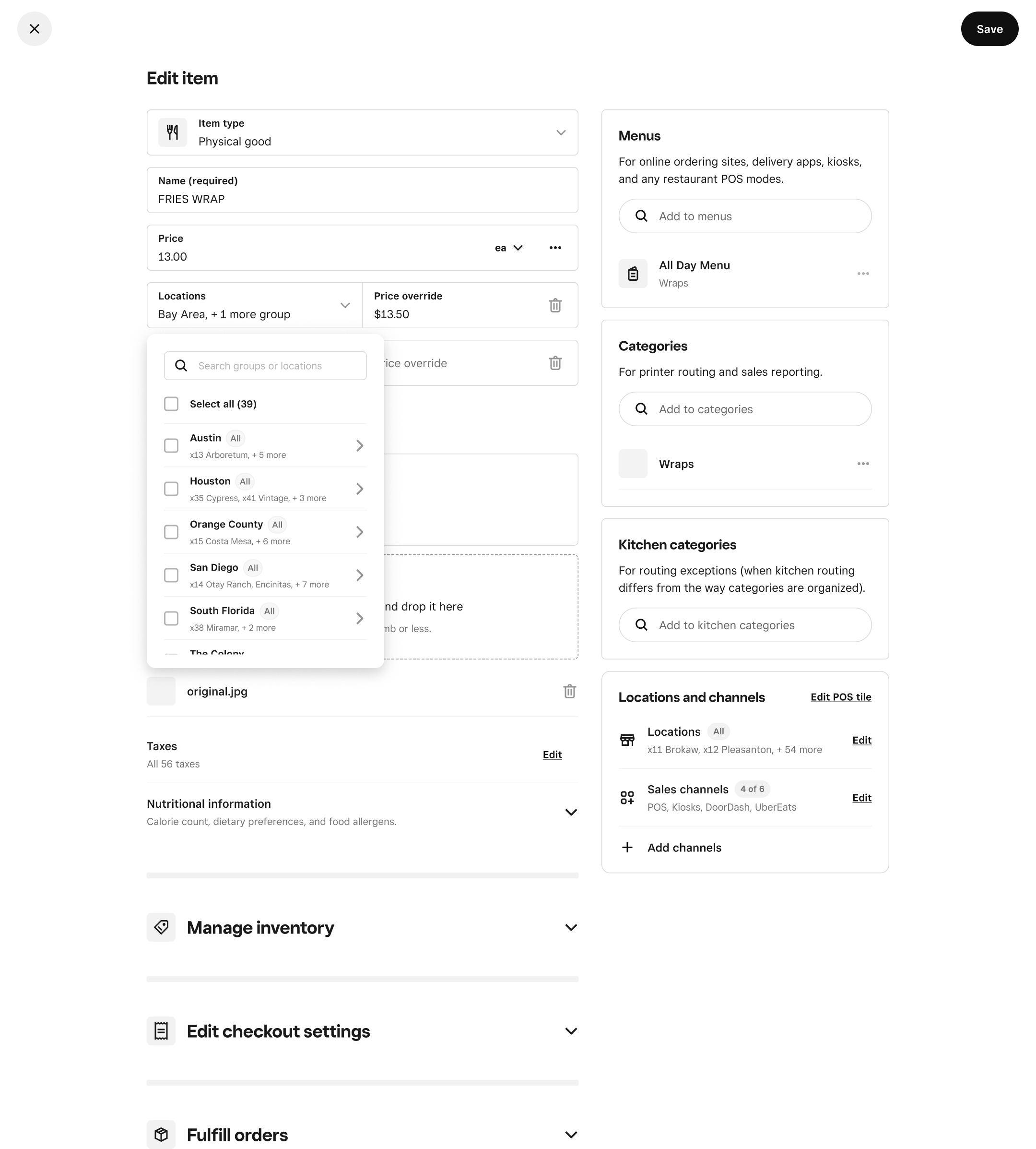
The first release established group creation and management, along with reporting. The planned next phase would bring groups into everyday operational work:
Update menus and prices across groups, reducing repeated location selection.
Handle exceptions and overlapping groups, making affected locations and pricing conflicts clear before changes are applied.
Measure operational impact. I’d evaluate time spent completing updates and errors requiring correction alongside adoption.
03
Challenges & Learnings
Challenges
Limited validation. A tight timeline concentrated discovery on a few priority sellers and immediate uses in pricing, menus, and reporting. We had to establish shared patterns with limited evidence about broader seller needs and future integrations.
Keeping momentum across teams. Delivering value beyond group management required othre teams to integrate groups into their workflows. As partners changed, I worked to maintain alignment on scope and advocate for prioritization.
Learnings
Adapt collaboration to your partner’s experience. This was my ENG partner’s first seller-facing project after working on internal tools with different UI conventions. Unexpected implementation gaps showed that we needed more explicit alignment on design-system expectations. In future work together, I’d proactively check in and review builds earlier.
Checking implementation earlier
Late-stage QA surfaced interaction and visual discrepancies that exceeded our review window. I prioritized fixes with Engineering, but some compromises remained at launch. In future projects, I’d schedule earlier implementation reviews and establish shared expectations for design-system fidelity before development begins.
Overview
This is a personal project that I was inspired to do based on my own involvement in the art community and the social media platforms that come with it. I was the sole researcher/designer, but I also had a lot of assistance from artist friends and my follower-base, from whom I gained many valuable insights.
Role: UX Designer and Researcher
Duration: July - September 2019
Why did I start this project?

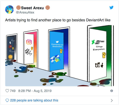
As a digital artist who’s grown up alongside the online art community, having an online art presence has always been important to me, as it’s the source of my customer-base and connections with fellow artists that keep me inspired.However, there currently aren’t enough platforms that prioritize artists’ needs, and the ones that do are dying off (e.g. DeviantArt) or inadequate to begin with. As a result, in recent years especially, there has been a shift towards widely used platforms that are non-art-centric, such as Instagram and Twitter. For many artists, this is simply a last resort.The most recent surge of complaints prompted me to think of a viable solution within my capabilities. And of course, beyond my personal interest in art, I also thought this would be a good opportunity for some design practice!
PROBLEM
Digital artists are having trouble with finding work opportunities, because there’s no place they can present their work where they can easily get exposure from people who want to buy art or hire.In other words, how might we help digital artists attract business and followers?
SOLUTION
Improve Twitter’s existing features to allow users to find people and tweet content by areas of interest, so as to increase discoverability of digital artists on a platform with a pre-existing large audience.
01
Exploratory Research
Q. What is currently the best social media platform for artists?
Before launching into field research of any sort, this was the question I wanted to explore first. Through online research, I compiled a list of current most popular social media platforms among artists and did a competitive analysis on those top four, based on the data and statistics I found.
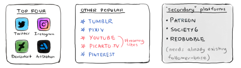
As this project focuses primarily on digital artists in the illustration field (this includes game concept artists etc.), other well known platforms such as Dribble or Behance, while considered briefly in the competitive analysis, were not researched in depth due to their focus being primarily on design.

competitive analysis of existing platforms (top four)

Why not the "other popular" platforms?The other platforms not in the top four were also analyzed, but in less detail. They were not considered for the following reasons:
Tumblr is no longer popular as a platform for artists due to new strict rules/a change of ownership
Pixiv is a portfolio art site but has a predominantly Japanese community
YouTube/Picarto are mostly streaming sites for tutorials/art processes
Pinterest has an easy sharing/pinning system, and primarily focuses on art forms like interior design/decoration etc. There’s limited interaction between users
Secondary platforms are for the distribution of prints and merchandise and usually require an already existing follower-base elsewhere before being able to gain traction
Q. Why Twitter?
Twitter is often used by artists for its marketing potentialOut of all four platforms, Twitter has the most...
communication between users
potential for discoverability regardless of follower count (retweeting feature; spreading the news)
suitable demographic, and therefore reach, for casual commissioners as well as professional recruiters
18-29 age range most common
wealthy population ( source )


Q. How prominent is the art community?
#art is the 4th most popular hashtag on Instagram (source)In its 2017 survey, art marketplace Invaluable found that:
nearly 56% of U.S. consumers ages 18-24 said they would buy art online
45% said social media is the main way they discover art ( source )
Looking at the future—traditionally, those who buy art tend to be older, so once that younger generation grows older, their influence will grow ( source )
Q. So... what does this mean for Twitter?
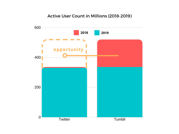
Artists leaving Tumblr and DeviantArt are potential new users for Twitter!In its 2017 survey, art marketplace Invaluable found that:
Twitter’s overall usage has dropped 6 million from 2018 -2019 ( source )
DeviantArt’s active user count has been steadily dropping over the years
“…DeviantArt is sort of a dinosaur or living fossil in the internet world.” - Van Baarle
Since December 2018, when it was acquired and strict new rules on content + a new filter system was established, Tumblr's active user count dropped more than 30% ( source )
520 million (Dec 2018) —> 336 million active users (Oct 2019)
02
Primary Research
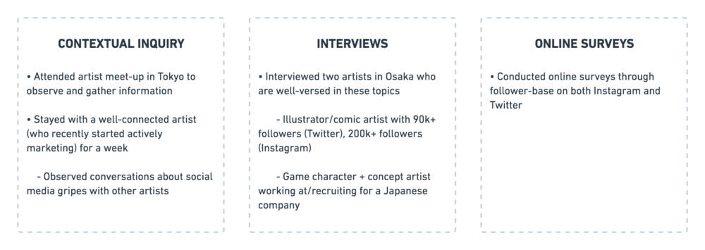
Having determined what trajectory to focus on, I then sought out opportunities to interact with and gain insights from my stakeholders. To reiterate, they are:
Artists trying to sell/promote their art work
Consumers/businesses looking for art work (commissions, recruits, etc.)
🤝 Tokyo Artist Meetup
To meet a variety of international artists beyond my own circle and widen my perspective, I attended an artist meet-up in Japan.I chose to travel to Japan as it’s Twitter’s second biggest market after the US, and I wanted to better understand how the art & social media culture differed there. The meet-up gave me an opportunity to talk to artists with varying interests outside my own follower-base and network.


“It doesn’t matter how good your art is if you don’t know how to market your work.””I wish Twitter would bring back the media grid.””Tumblr before it died was perfect for artists! The tags system was great.”— Artists at the meet-up
Research Findings
1. What sort of artists are on Twitter?
Primarily digital artists who do illustrations—from concept art to fan art. Many of them take commissions or have merchandise shops (selling pins, tote bags, etc. with their art on it), or attend artist conventions.2. What sort of art are people most interested in seeing from others?
Game concept art (character and environmental)
Original illustrations
Fan art
3. How are artists discovered through social media?
Many people say it’s difficult to discover new artists/artists who aren’t already popular; likewise on the artists’ end.4. How do people find commissions?
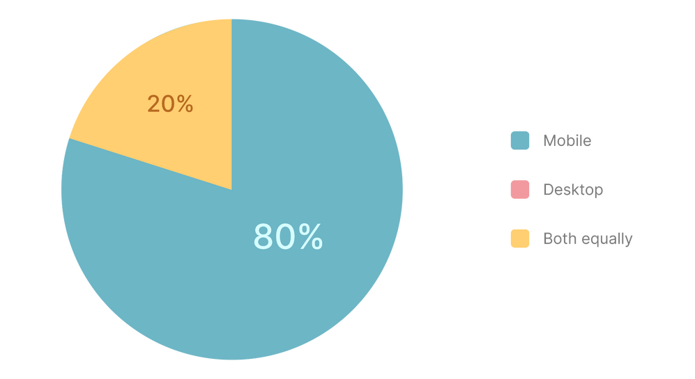
People typically find artists to commission through the the commissions hashtag or from people they already follow.5. Do people in the art community tend to use mobile or desktop Twitter more?
People use the mobile version of Twitter more often. (data below is from survey results)
03
Analysis
To synthesize findings, I created an affinity diagram to better understand the users I’m designing for.
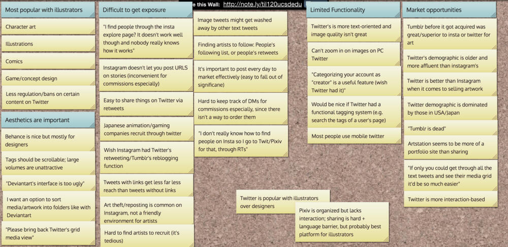
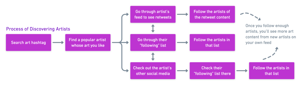
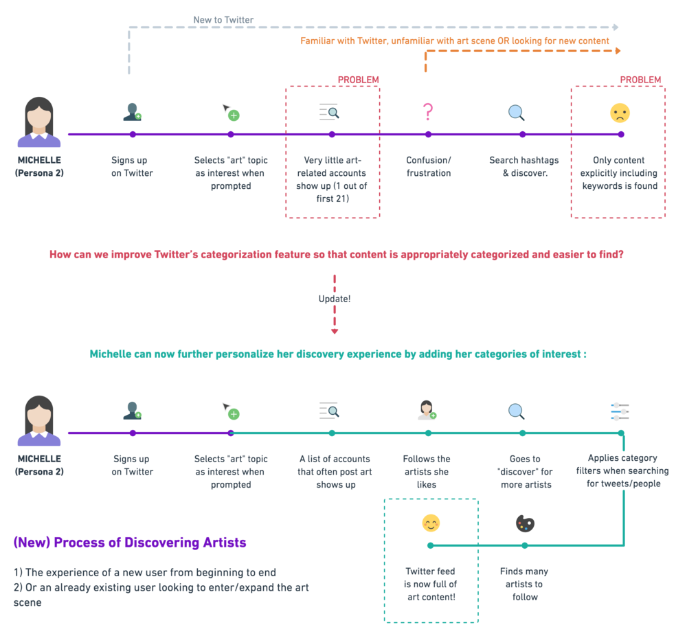
I also roughly mapped out the flow of several key processes: discovering artists, the commission process, and how artists upload art.
Persona & User Story


While I initially began with three personas, I ultimately decided to focus on the first two as a pair (the casual commissioner applies to many more twitter users in general than the professional recruiter).
As a digital artist, I want my work to reach a wider applicable audience.
As a Twitter user interested in but new to art, I want to be able to find artists quickly and easily.
Current Artist & User Flow
To better understand pain points and also to use as a reference, I created diagrams of the processes artists and consumers go through. As can be seen, the current way of discovering artists is rather tedious and inefficient.


🔑 Key Takeaway & Goal...
How can we simplify the process of discovering artists?
04
Ideation
With this goal in mind, I sketched out as many solutions as I could think of. Some were a little more unconventional than others, but these were some of my favorites:


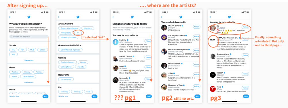
After evaluating the pros and cons of these ideas, I decided to focus on idea 3: “Tweet categorization” as this was most plausible and optimizes use of an already existing Twitter feature, with some incorporation of other ideas as minor features too, such as idea 4.To better understand the current categorization mechanism on Twitter, I emulated the process of joining Twitter for the first time and trying to find artists from scratch.
Concept Sketch


Wireframes

04
Final Solution Breakdown
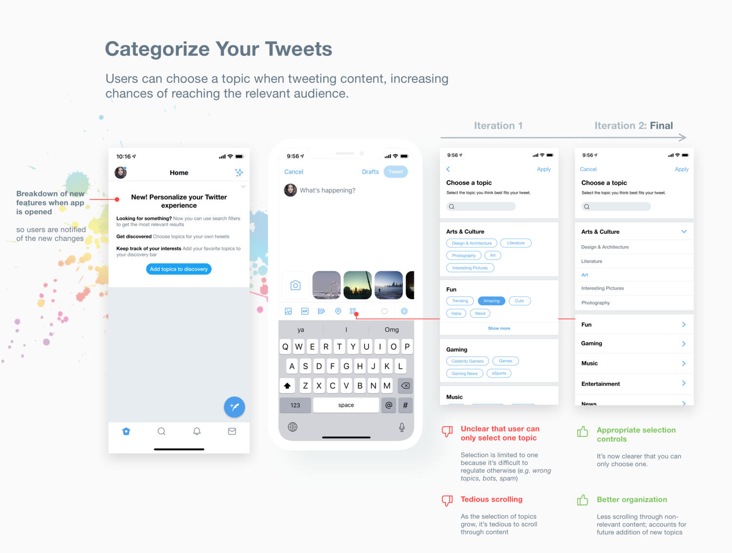
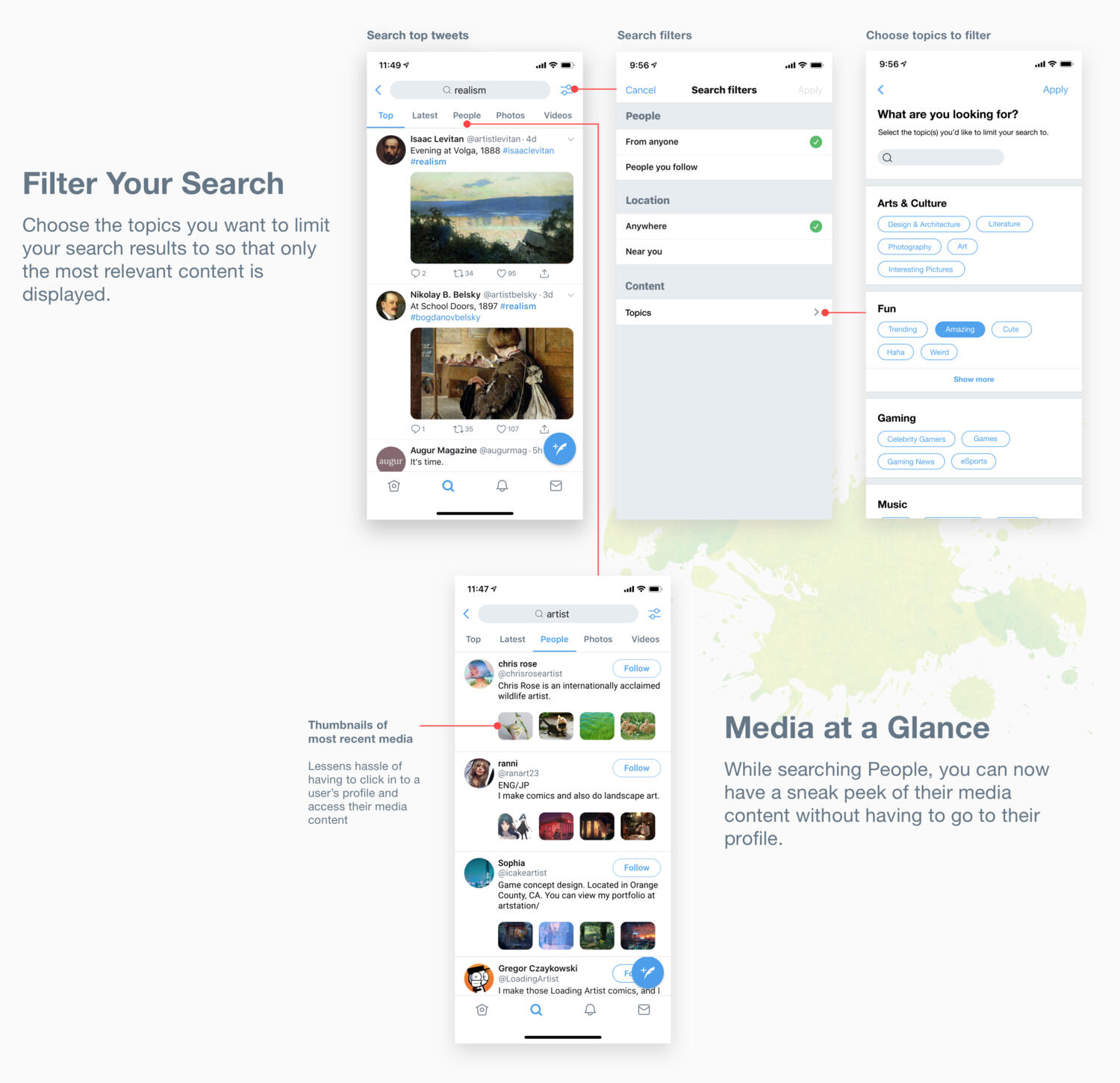
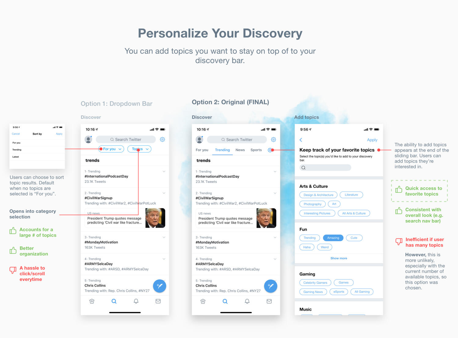
Using Twitter’s already existing categorization feature (“Topics”), users can now search and categorize their own content, as well as keep track of relevant categories in their discovery bar.
05
Reflection
Limitations/Challenges
Pre-existing bias for Instagram/Twitter as popular platforms and survey participants’ art interests because they come from my own follower base on Instagram/Twitter
My ways of accessing the consumer base are limited
Additional bias: I have 3x more followers on Instagram than Twitter
Language constraints: most Japanese artists I interacted with also know some English, or are fully bilingual
I wanted to fit most new elements into Twitter’s current design and keep them as unobtrusive as possible but this was difficult for some parts
Learnings
Doing in-depth online research when resources are scarce
Having to go back and redesign elements that don’t work
Next Steps
Additional (minor) modifications to Twitter that would enhance the art experience:
Classifying accounts or their interests
Enables additional filtering for account search
Option to select how to order inbox/direct messages
Efficient for large volumes of messages (e.g. organizing commissions)
It’s not currently possible with my available resources, but I’d like to work on creating an entirely new platform for artists in the near future.
Other projects you can check out:
Yelp Appointments

Housing App
Overview
This is a project I worked on during my participation in Design Co's Level Up fellowship, a ten-week program that gives students the opportunity to develop innovative solutions to real-world problems under the guidance of industry mentors..As part of a team of four, our goal was to design a digital solution for small business recovery during the COVID pandemic. We chose to expand on existing Yelp features (e.g. "appointments") to streamline the process of creating an online presence for small businesses in personal services such as hair and nail salons, as well as to address cash flow concerns.
| DURATION | ROLE | TEAM | TOOLS |
|---|---|---|---|
| July - Sept '20 | Visual & UI Designer | Fiona Wong | Figma |
| . | UX Research | Tanish Jindal | Miro |
| . | . | Natalie Hun | Adobe PS & AI |
PROBLEM
Small businesses in the personal service sector—such as hair salons—are suffering financial losses due to less customers coming in during the COVID pandemic.
SOLUTION
We redesigned Yelp to better accommodate personal service businesses post-COVID by enabling an in-app booking function with an at-home option, as well as a gift card feature to help with cash flow concerns.
01
Discover
Q. Why personal services?
We decided to focus on the personal services sector for the following reasons:
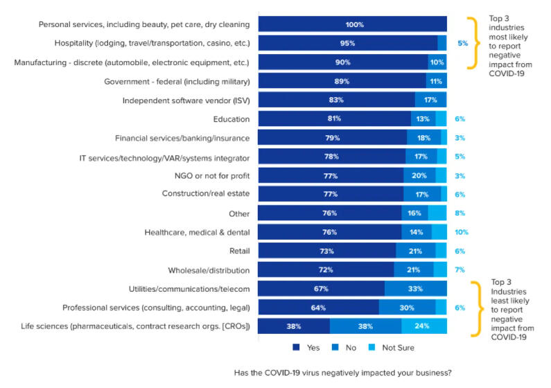
It's one of the sectors most affected by the pandemic
They could benefit from an online presence
Few immediate solutions come to mind that help personal service businesses—most are geared towards the food/restaurant industry
Personal experience: The unexpected struggle of needing a haircut and not being able to get one 😞

image source: https://workdrive.zohoexternal.com/external/5dGPC0p4NzI-LXPwY
Q. Who are our stakeholders?
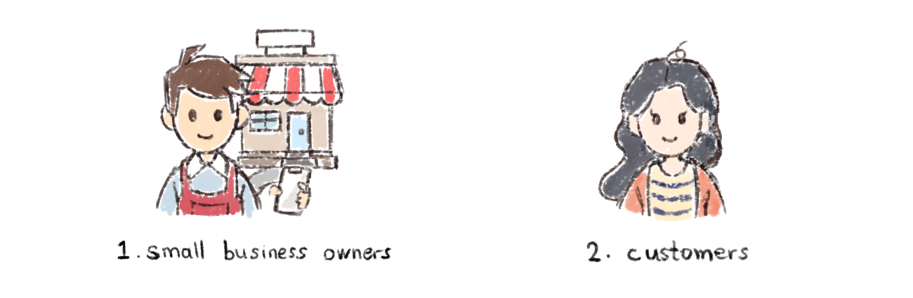
We conducted interviews with 4 small business owners over Zoom to gain more insight on their day-to-day and the obstacles they've had to face as a result of the pandemic.We also wanted to learn more about changing customer behavior and pain points in response to the pandemic, so we set up interviews with customers and sent out surveys through social media platforms such as Facebook and Reddit in order to widen our reach.
Research Findings
Q. Why aren't people using personal services anymore?
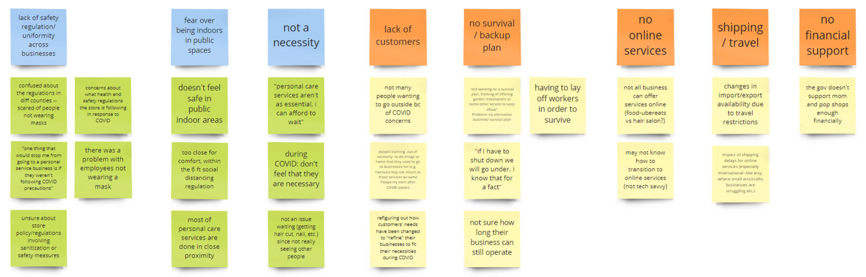
Fear over being indoors in public spaces
Lack of uniformity of safety regulations across businesses
Lack of awareness regarding COVID precautions taken by the consumers and workers
Personal services are not considered a necessity
Q. What are business owners struggling with?
Lack of customers + safety costs = finances/cash flow concerns
Inexperience with crafting an online presence
Uncertainty over lockdown time period
Q. How are business owners coping?
Implementing new safety regulations
Advertising new deals and promotions
"It would be nice if there's any way to announce our cleaning protocol is 100% in effect so we can rebuild some trust with our customers." — Owner of Bark! Bark!“An online presence would really be helpful, but we don’t know where to start with that.”
— Owner of PCH Nail Salon
02
Define
To synthesize our data and better understand the problem areas, we created an affinity diagram, from which we were able to define user needs more clearly. We also created personas to reach a deeper understanding of the users we're designing for.

customer persona

business owner persona


| User | Need |
|---|---|
| Customer | Assurance that resuming use of services is safe / services are taking the necessary COVID safety precautions |
| Small Business Owner | A way to communicate changes effectively and easily to customers so that more are willing to resume services |
🔑 KEY TAKEAWAY
How might we bridge the distrust between customers and small businesses?
03
Develop
We brainstormed solutions over Zoom and on Miro, and sketched out concepts and storyboards to help visualize our ideas and user needs.Our initial ideas revolved around the creation of a platform that would allow customers to easily discover businesses in their area and learn about their safety policies, as well as book appointments through the platform. When registering on the platform, business owners are guided through the process step-by-step, enabling even the least tech-savvy to craft an online presence easily and quickly.
Initial Concepts + Storyboard

CONCEPT 1: app that provides info on stores

CONCEPT 2: app plugin that automatically generates sites


storyboard for concept 1

Paper Prototype + Testing
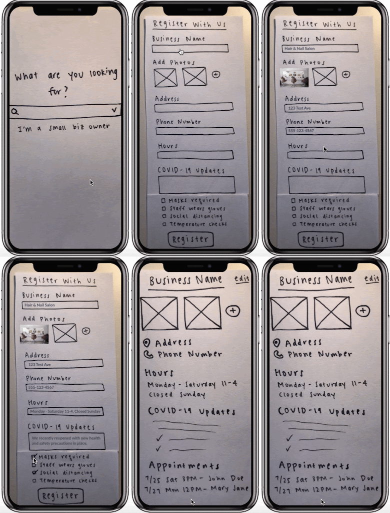
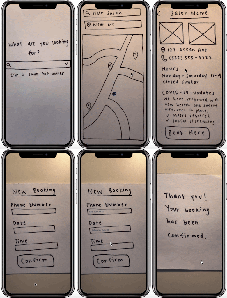
We created paper prototypes for concept testing with think-aloud protocol, using Marvel to digitize and make the prototype interactive so testing could be done remotely. Mainly, we wanted to know if users understood the concept behind our app, and if this was something they personally would use.

smb flow

customer flow
However, from the initial round of testing we learned that:
75% of our users felt limited when using the app -- there was not enough value in the features and capabilities of the app for them to commit to downloading it
There was confusion as to the purpose of the app -- most users missed the informative aspect and understood it to be only an app for locating businesses
✏️ BACK TO THE DRAWING BOARD...
Based on the feedback we received, we decided to take an entirely new direction, discovering potential in leveraging existing features on Yelp as a solution to our problem.
Q. Why Yelp?
With 28 million downloads per month, it’s an established app most people already have on their phones
The best marketing option for small businesses due to affluent, wide + evenly distributed age-range demographic and high intent of customers (source)
It targets small businesses more specifically and exists in app format (as opposed to Google, which is more general)
It has existing features similar to appointment-booking
Q. How does this benefit Yelp?
Aligns with the direction Yelp is moving towards: becoming a one-stop platform for people to connect and transact with local businesses
Differentiation from its main market competitors (Google and Facebook)
🔭 Refining our question...
How might we build on Yelp's existing features to allow customers to connect and transact with local businesses more effectively in light of COVID?
Yelp's existing features include the ability for users to "request" an appointment in-app, which is essentially request a quote. The act of officially booking an appointment can only be done through a third-party app plugin, which isn't available to all businesses.
Our Proposal
Allow users to:
Book appointments directly in-app via the business page
Book an at home appointment for businesses that offer this option
Purchase gift cards in-app (to increase cash flow for businesses due to less customers coming in)
05
User Testing
We went through several rounds of testing on our mid-fidelity prototype and made modifications to our design based on the feedback we received from users.
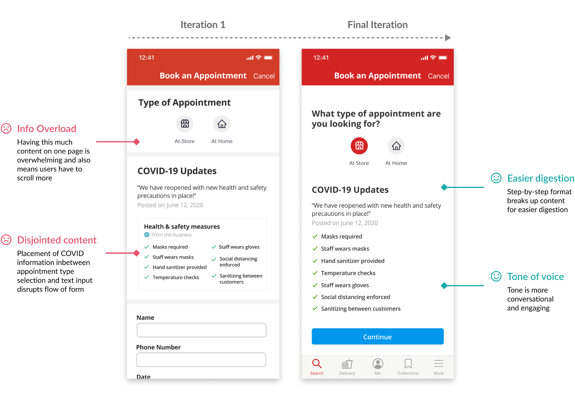
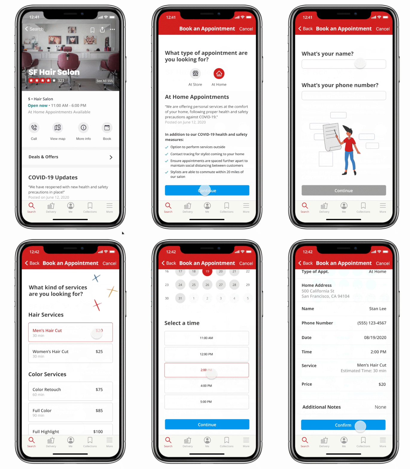
Appointment Booking
In our initial design, the appointment booking form was one long scrollable page. After testing, we opted for a step-by-step booking process, separating information and input into sections.
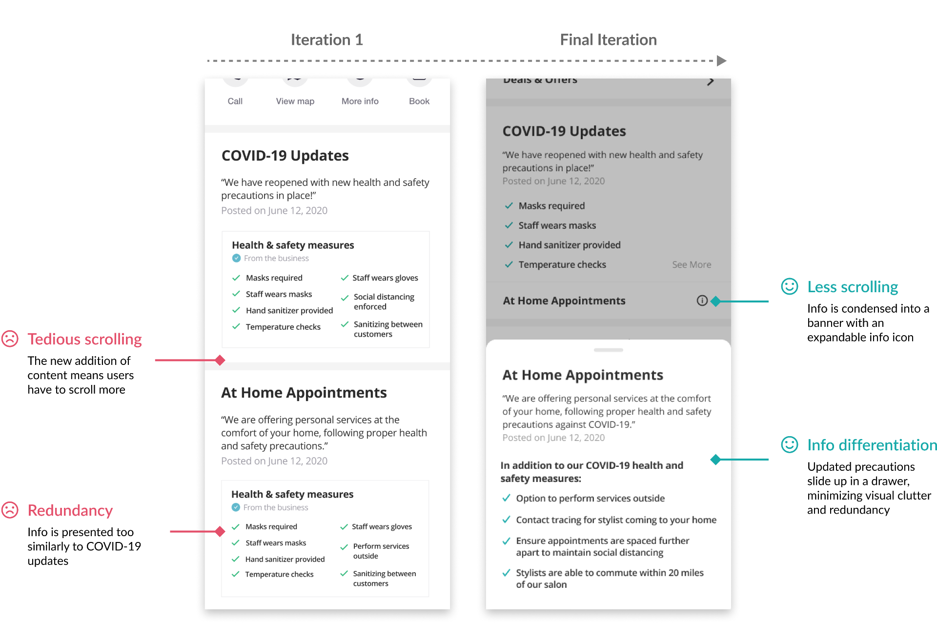
At Home Appointments
We wanted to display relevant information in a way that would be easily digestible for users when reading through it, in a style that adheres to Yelp's design system.
Gift Cards
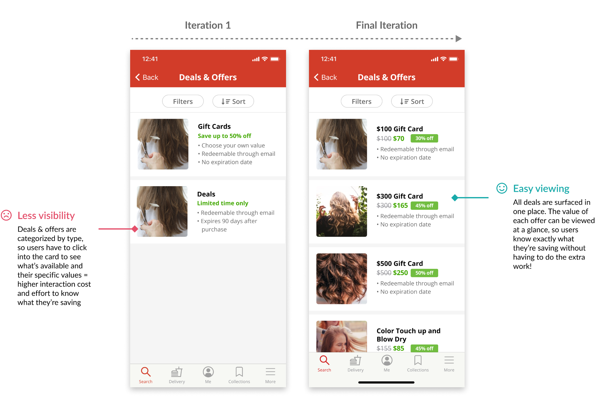
We wanted to find a way to show relevant offers to users in an intuitive location, instead of them having to navigate to the deals and offers section under the "More" tab in Yelp's original design.
06
Final Design
Flexible booking
Users can book an appointment directly in the Yelp app, with options to select in-store or at-home appointments if offered by the business.
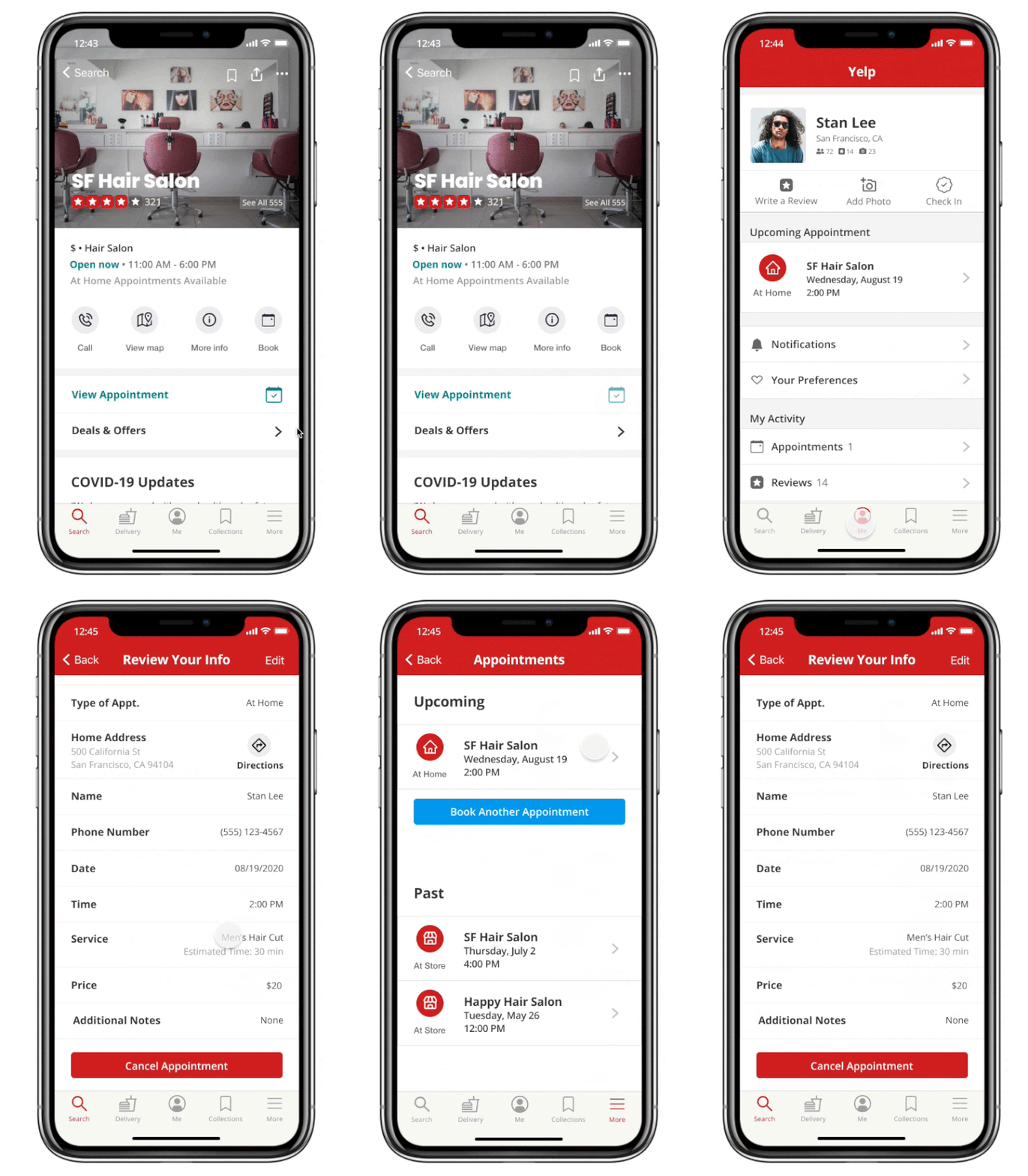
View appointments
Users can keep track of their appointments by navigating from the business page, the "me" tab, or the "more" tab in the bottom menu.
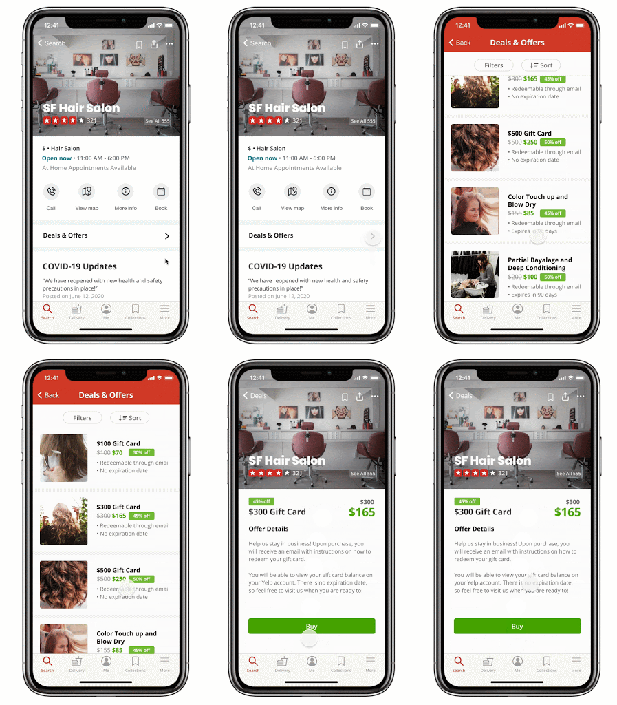
In-app deals
Users can easily access, filter through, and purchase gift cards and other deals in the app directly through the business page, supporting their favorite businesses in the process.
06
Illustrations



07
Retrospective
Constraints
User research— we were limited to mostly remote interviews due to the current pandemic situation
Yelp’s publicly released style guide hasn’t been updated for some time, so we had to make some decisions that may deviate from Yelp’s current style
Challenges
Having to pivot in the middle while on a tight timeline after realizing our original idea wouldn’t work
Conducting the entire project remotely
The situation we’re in is fairly new and unique— we’re limited by information we ourselves as well as the general public can’t be sure of, as well as how fast apps are evolving to tackle these unprecedented problems that are popping up. In fact, as we were finalizing our prototype, Yelp updated their quotes feature to include the ability to book appointments
Other projects you can check out:

Twitter for Artists

Housing App
Overview
This is a project developed for one of my UX design courses (COGS 102 HCI Design), under the instruction of Scott Klemmer, in which the goal was to design a mobile web application under the theme of presenting information. We designed a housing app that helps users—specifically, UCSD students who require shared living spaces—simplify the experience of finding suitable living arrangements.As the UX designer and researcher, my main contributions involved project planning/management, information architecture, UI design, and front-end programming.
| DURATION | ROLE | TEAM | TOOLS |
|---|---|---|---|
| Feb - March '19 | UX Designer | David Dinata | Sketch |
| . | UX Researcher | . | Invision |
| . | . | . | Adobe XD |
| . | . | . | Adobe PS |
PROBLEM
Users don't have a way to efficiently search for housing that meets all their criteria; many end up wasting a lot of time scrolling through endless posts in Facebook groups that are often missing information.In other words—how can we minimize the time and effort spent looking for suitable living arrangements?
SOLUTION
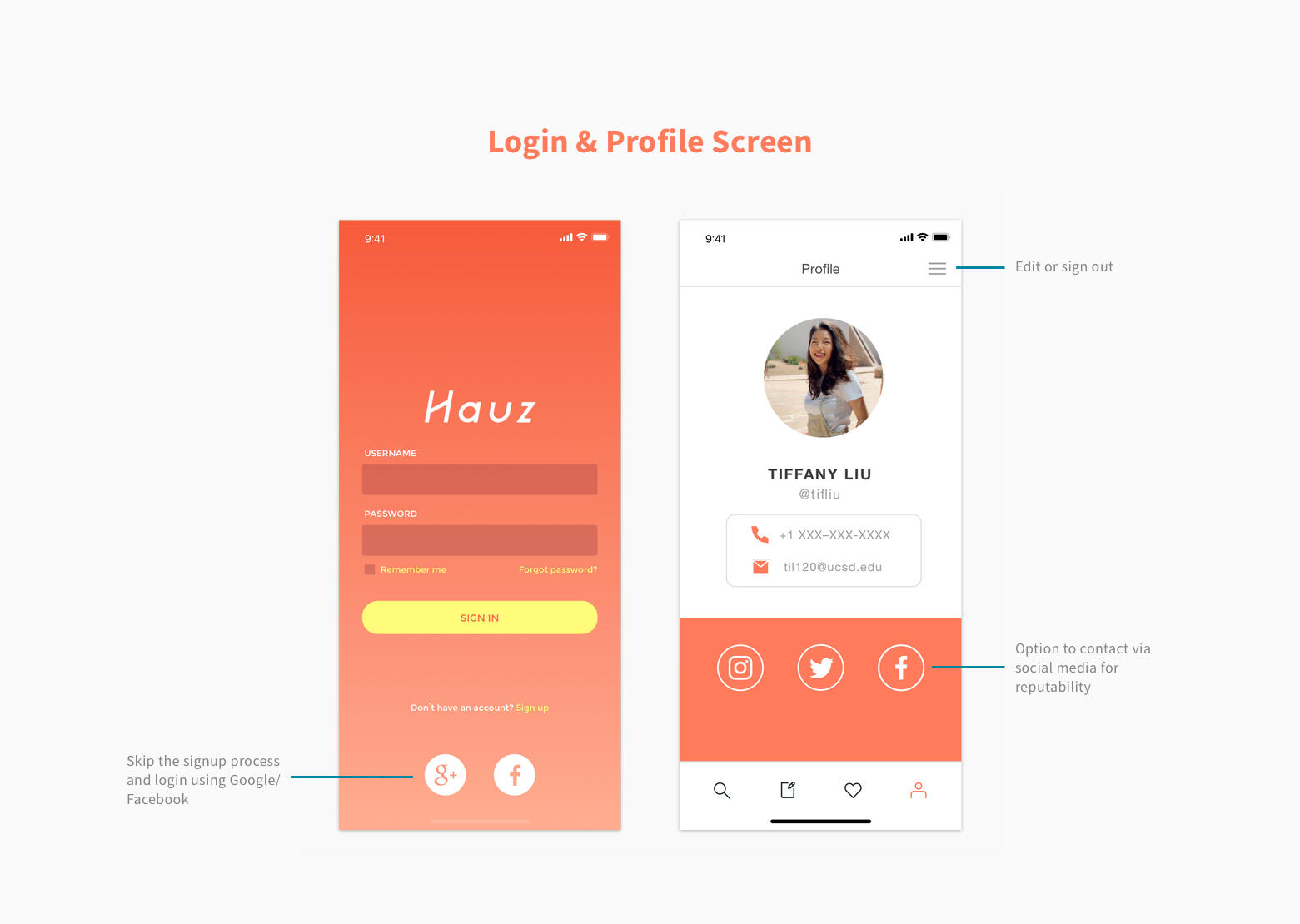
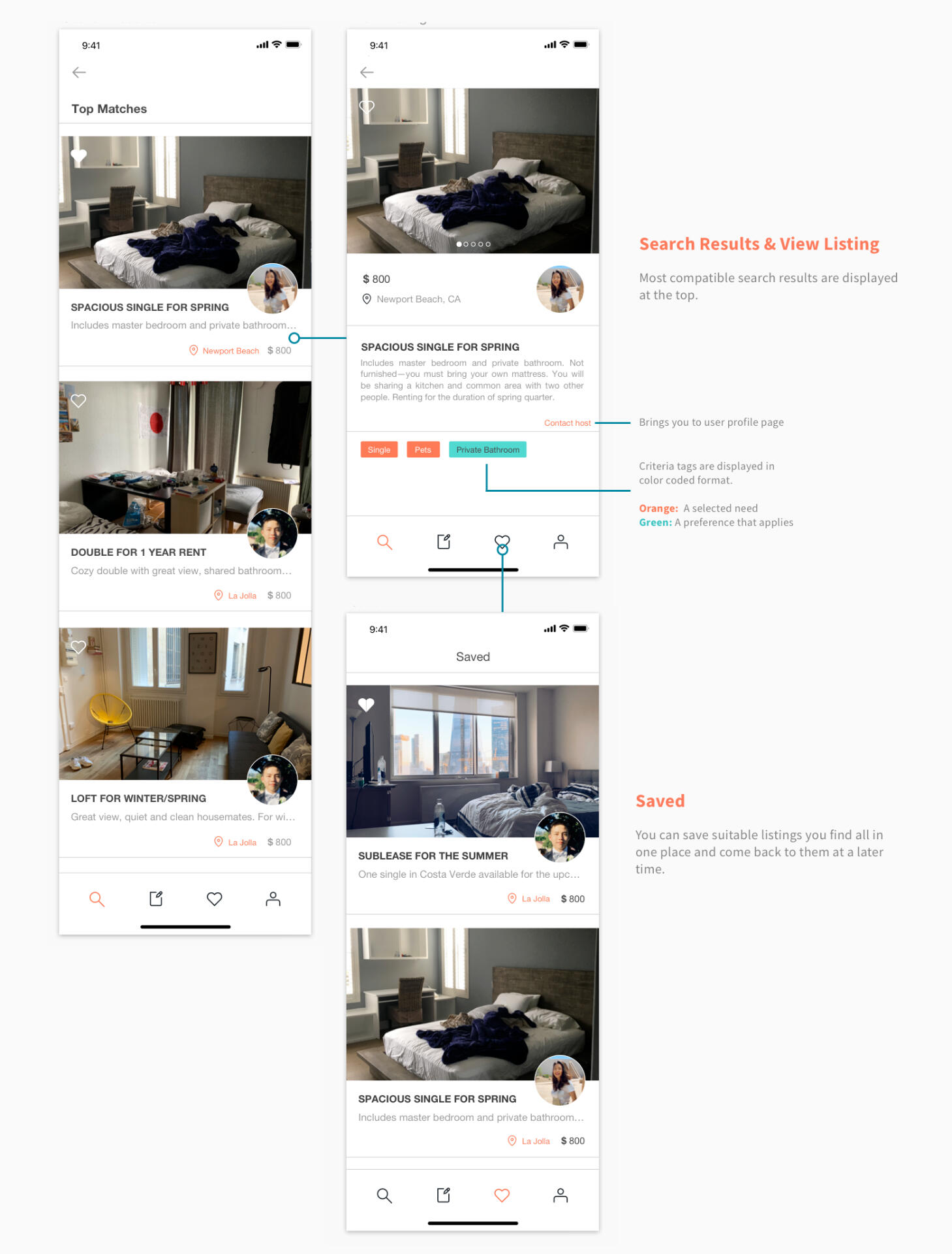
Hauz enables users to search and filter listings that match their needs easily, presenting information in an organized way, and sorts results based on compatibility. Users can also make their own listing.
01
User Research
The idea for Hauz was inspired by our own personal struggles with searching for student housing, and so the scope of our user-base is primarily college students sophomore year and upwards, who most commonly live off-campus.
Q. What methods do college students use to find housing?
We wanted to know about the methods college students use when looking for housing and why they used them, and upon interviewing eight college students, we found that:

Facebook housing groups for specific colleges is the most popular method, particularly for subleasing and leases under one year
Going directly to apartment leasing offices is a common method for second-years about to move off-campus for the first time and with a full house of roommates already decided
Taking over a graduating/moving friend's lease or mutual acquaintance through word of mouth is another method, but less common
Students say they prefer using Facebook because of the wide network (i.e. fact that most students have Facebook), as well as the ability to view user profiles, which allows them to judge reputability. However, some complaints they had:
Lack of information on some posts
Poor communication—people often don't take down their posts after they've found someone
No ability to filter through the flood of posts to see applicable ones
Based on these results, we decided to utilize the Facebook housing groups as our primary resource. We gathered data on what sort of criteria people looked for in their housing posts, and made a list of the most common ones we saw, such as whether or not pets were allowed, amenities, or noise levels.

02
Storyboarding
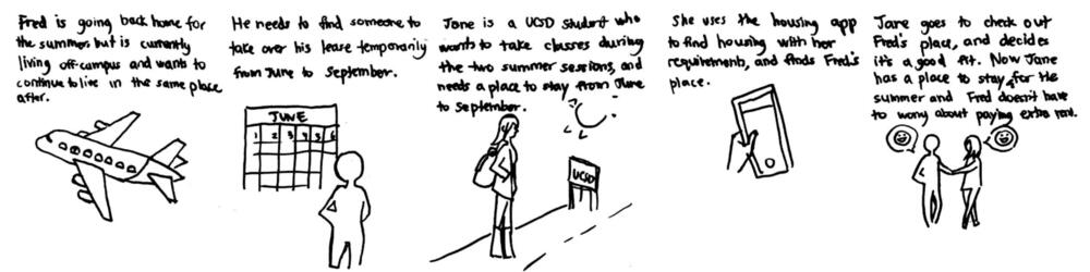
We created multiple storyboards to illustrate a user need. In one of these situations, someone who is looking to sublease their place temporarily is able to find someone who is looking to take over a place temporarily in a fast and easy way through using the app, fulfilling both their housing needs.
03
Wireframing + Prototyping
Our initial paper/sketch prototype's main features include a home feed page and the search listing page, and were evaluated by our peers using Jakob Nielson's ten usability heuristics.Feedback we received was mostly confusion over some functions (e.g. location of creating a listing was not intuitive), which we then changed in our next digital iteration.


04
High-Fidelity Prototyping
Modifications from User Feedback
We decided to get rid of some features that weren't really serving a purpose, such as the main feed page, as we wanted our app to be as simple and straightforward to the point as possible.
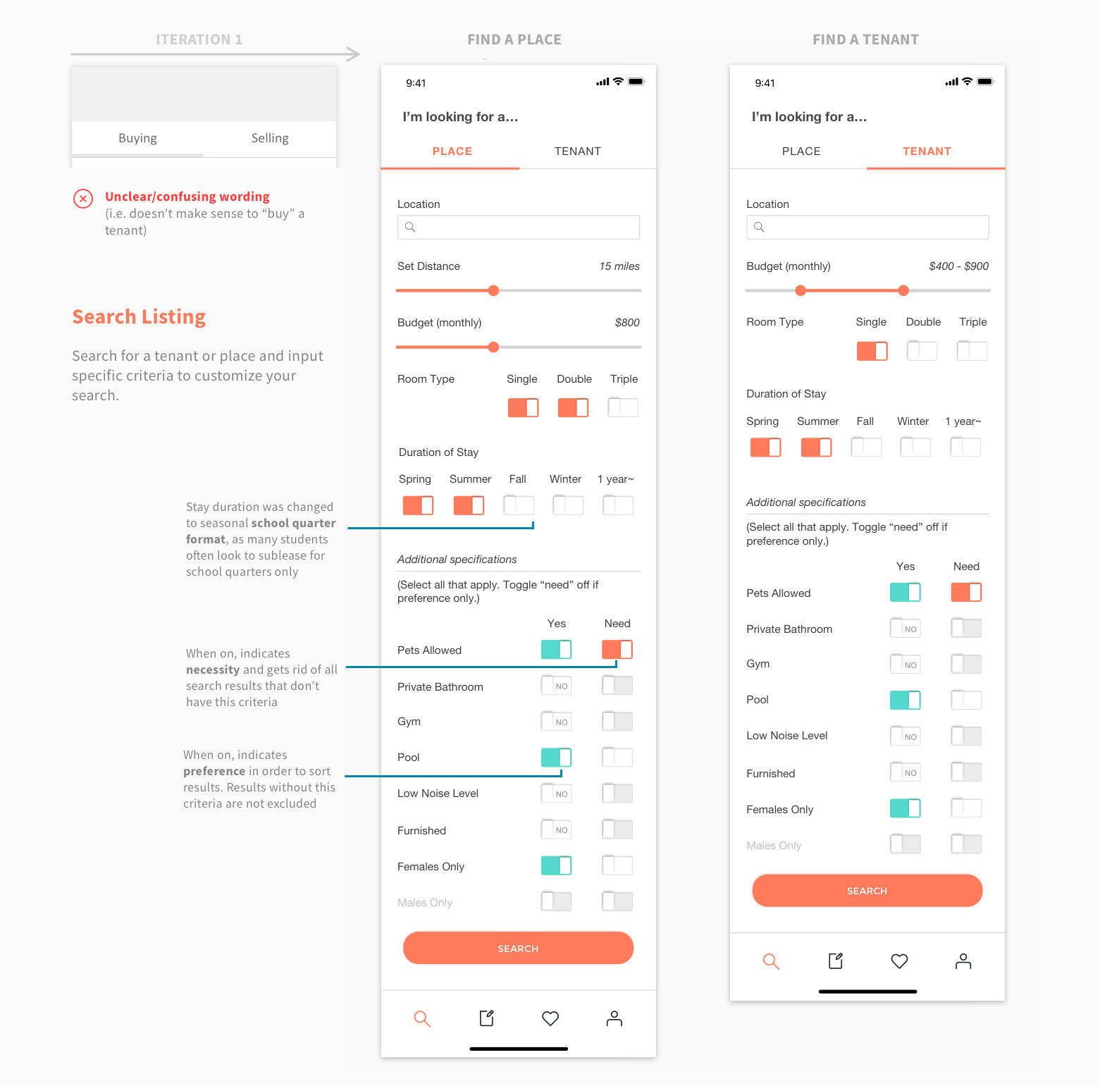
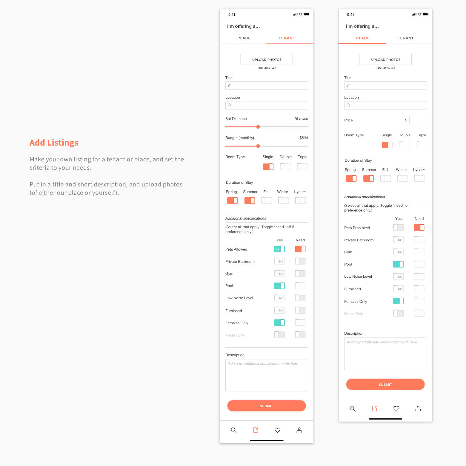
The "buying" and "selling" tabs were confusing for many users (buying would have meant you were looking for a place, and selling would have meant you were renting out your place), so we decided to change this to "place" and "tenant" and include a header at top—"I'm offering a..." or "I'm looking for a..." to make things clearer.
We rearranged and added criteria, such as duration of stay. As our userbase is college students, we opted to have the duration of stay be in seasonal format, as many students often look to sublease for school semesters/quarters only.
04
User Testing
Hi-Fi User Feedback & Changes
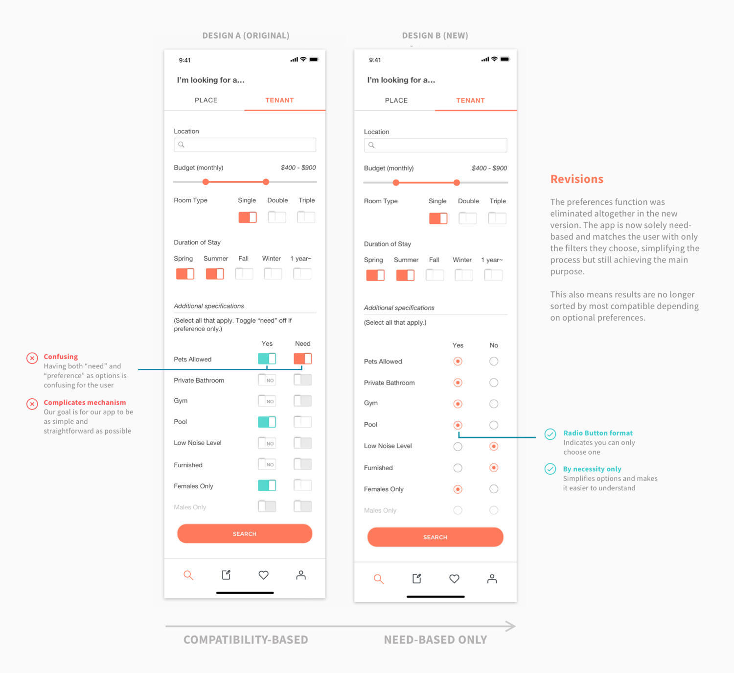
We had several users test our prototype’s features with our instructions and give us feedback. Three out of four users were students living off-campus, meaning they’d gone through the search process before and could therefore make comparison comments.We discovered that two of the users had some difficulty when they got to criteria selection—they were able to complete the task of searching for a listing accurately, but would take a second to deduce what the meaning of "need" meant. Once they figured it out, completing the second task of adding the listing took no time at all.This signified to us that this particular feature may be confusing, and so we elected to redesign the toggle switch to a radio button format, and eliminate the preferences function altogether by switching the button options to "yes" and "no" only. This means results will no longer be sorted by compatibility.
A/B Testing
After making the modifications, A/B testing was done using Google Analytics to determine the effectiveness of the modifications, based on how much time users spent on each page. We sent out links for each design remotely as well as doing testing in-person.To increase validity, we gave each person only one of the links, so that their experience on one design wouldn’t affect the other and create a confounding variable.


The results of our testing indicate that Design B is the more effective choice.
05
Reflection
Due to the fast pace of the course and limited time with which we had to complete our project, as well as unexpected circumstances that led my team to be short one member, I was able to learn a lot in a short time, including valuable lessons on planning and management.In addition, I gained invaluable front-end programming experience, and became more familiar with JavaScript, whereas before I had primarily only dealt with HTML/CSS in web design.However, we also had to sacrifice certain features that I believe would have made our app a lot better, such as an in-app messaging function. Given the chance to redo our project, we would:
Flesh out our development plan in full detail from the very beginning, before working on anything else
Explore more options at an early stage
Other projects you can check out:

Twitter for Art
Yelp Appointments
illustration
My traditional art is typically done with pencil (graphite/color), and my digital art is drawn with a Cintiq 1300 HD/iPad Pro and software Clip Studio Paint + Photoshop. I love experimenting with color and enjoy painting portraits the most!

Fan (Sketch Study), 2017

Bicycle (Sketch Study), 2017

Mother's Day (2017)

Father's Day (2015)

Alex (2014)

Autumn (2015)

Grass (2014)

Butterflies (2015)

Calypso (2015)

Self-Portrait (2015)

Fifty Years (2014)

Hidden You (2014)


zodiac collection
Picking up acrylic painting again after 7 years!For a casual personal project featuring animals from every chinese zodiac year starting 2022.


graphic design
Work done for Stary (2016) and various other contract jobs & school work.


portraits


places
Captured with iPhones (6 and XS).


About
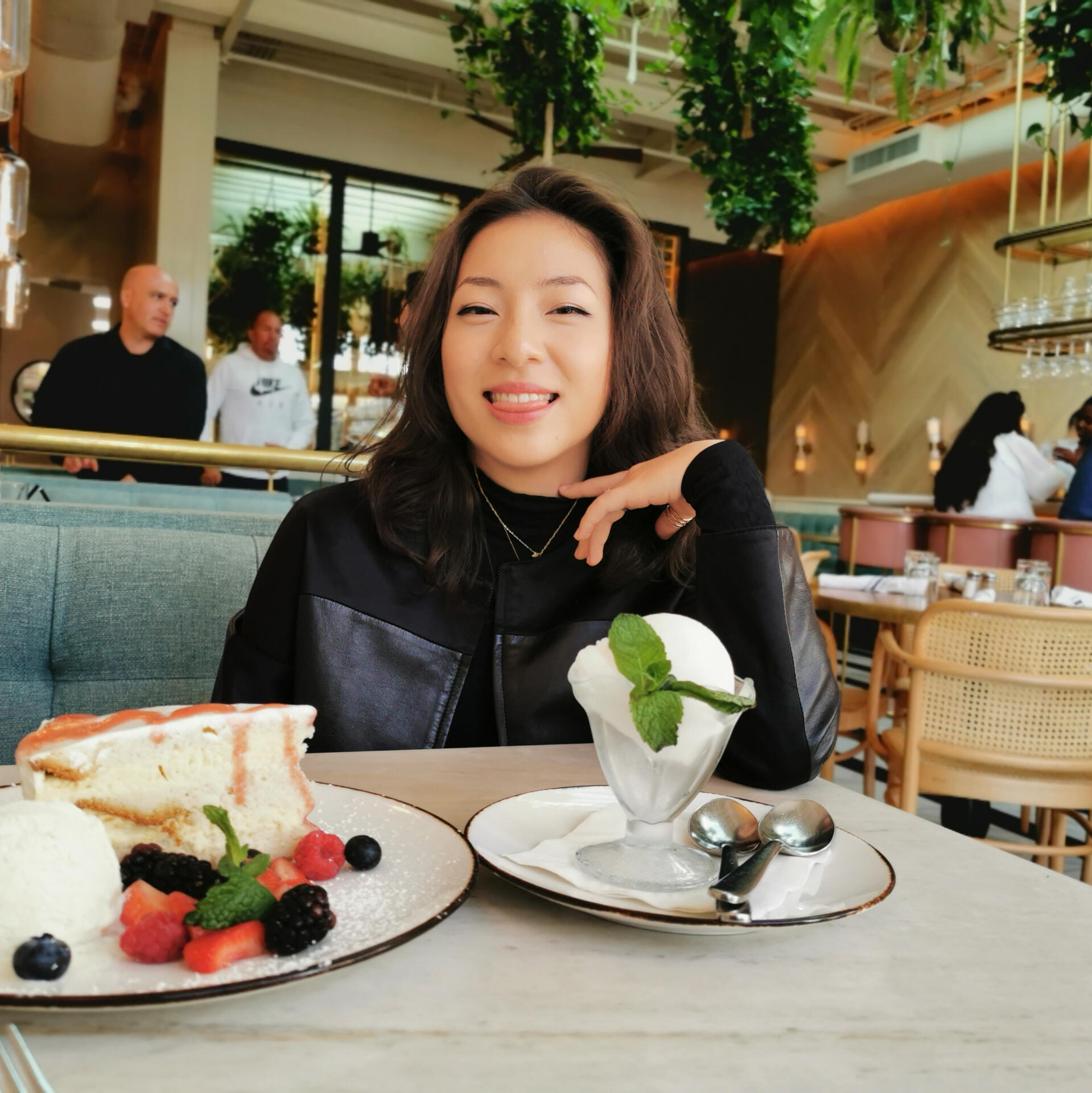
LA-born and Shanghai raised, Tiffany moved back to California in 2015 and has since graduated from UC San Diego with a B.S. in Cognitive Science: Human & Computer Interaction and a minor in Business.Her newfound pandemic-borne interests include aspirations of becoming a plant mom and tea connoisseur (she’s unfortunately nowhere near there yet).